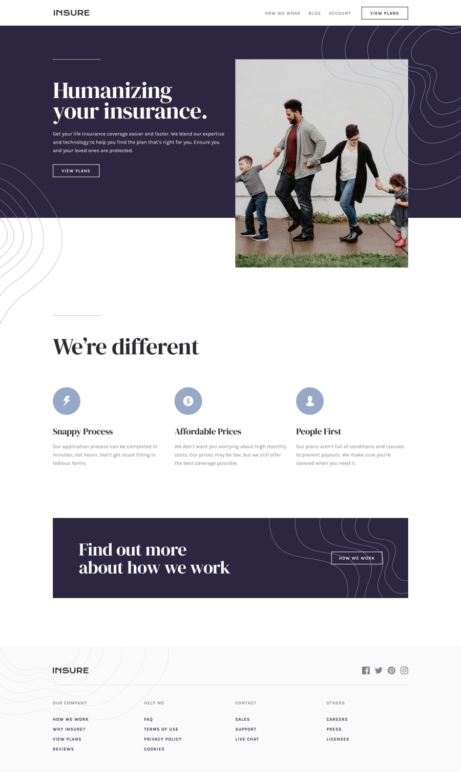
Design comparison
Solution retrospective
Not an easy challenge, but good practice...any thoughts?
Perhaps how do you deal with landscape mode? especially if you want to open up the nav menu...
Community feedback
- @mattstuddertPosted almost 5 years ago
Nice work, Vincenzo! I'm glad you found it to be good practice. Have I mentioned about trying to use
min-widthinstead ofmax-widthmedia queries before? They're great as they load in fewer styles for your mobile users, which can be a good performance benefit.For the nav in landscape on mobile, you could make sure it's never taller than the viewport so that no links overflow the bottom of the screen. You'd have to also play around with some of the spacings as well and maybe reduce the
font-size.Keep up the great work!
0@VincenzoMarcovecchioPosted almost 5 years ago@mattstuddert Great great stuff, thank you
0
Please log in to post a comment
Log in with GitHubJoin our Discord community
Join thousands of Frontend Mentor community members taking the challenges, sharing resources, helping each other, and chatting about all things front-end!
Join our Discord
