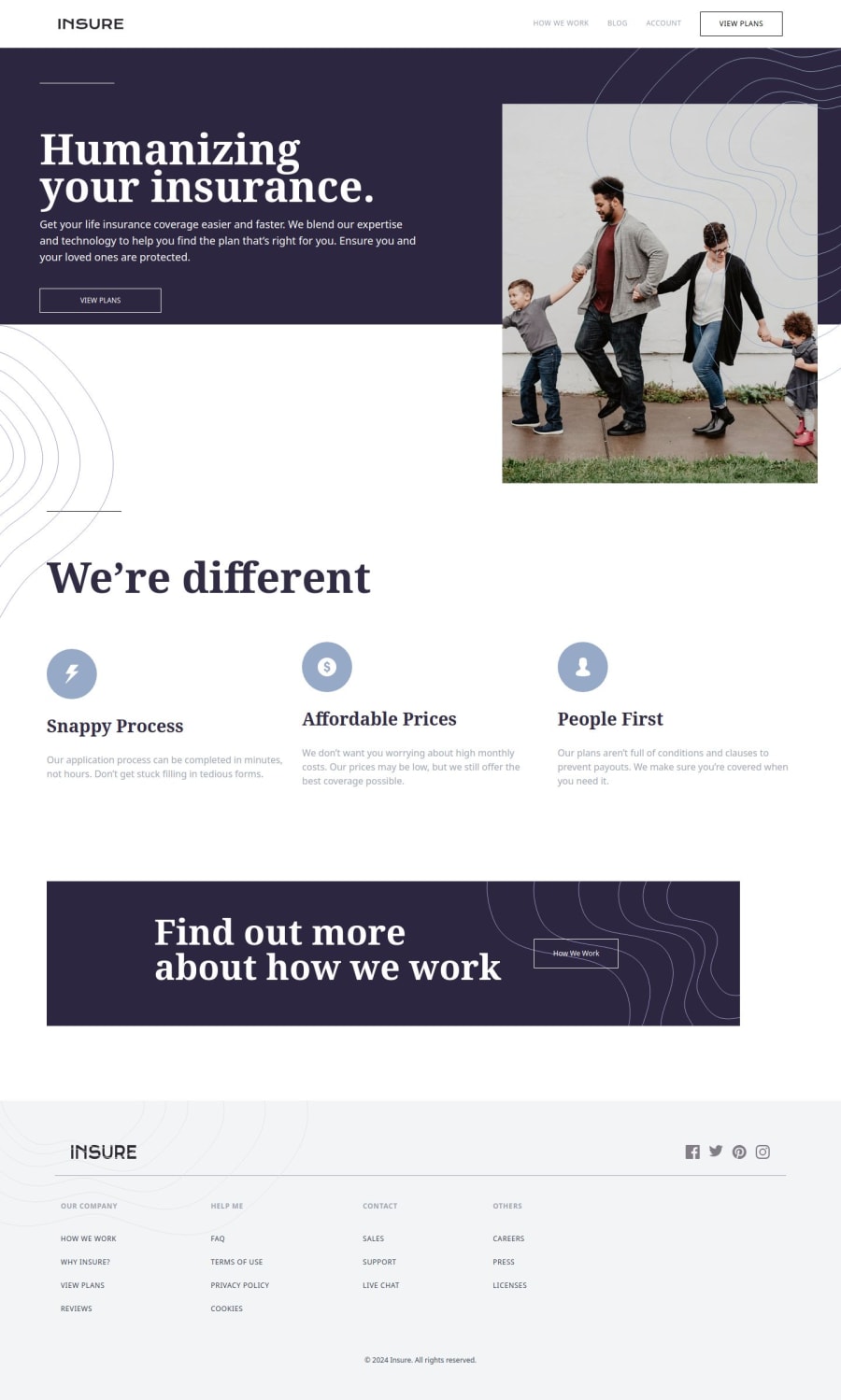


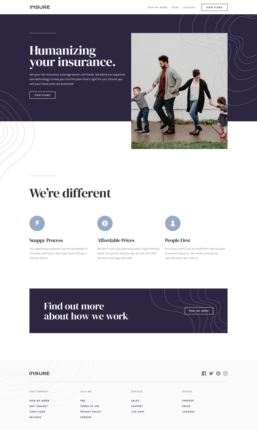
Design comparison
Solution retrospective
Any feedback is appreciated
Community feedback
- @sksksk2024Posted 2 months ago
Hello, @khaduj03! First, congrats on staying consistent with web development — keep it up, and you'll see great results! Now, after reviewing your project, here are a few adjustments to make it more user-friendly:
- Place all decorative images (like the line shapes) behind the content using z-index to prevent them from overlapping and blocking access to the content.
- Ensure the mobile menu is visible for all screen widths (I couldn’t see the menu between
768pxand1024px). Use a higher z-index for the close (X) button to bring it to the front. - For the mobile menu, make it full-screen and apply overflow-clip (
not hidden, as hidden can cause random issues) to prevent scrolling and improve the layout. - Align the items with
align-items: centeroritems-centerif you're using Tailwind CSS to create a more polished and user-friendly experience.
Lastly, keep experimenting and enjoying the journey. With more people entering the field, strong projects will help you stand out. You don't need to change this website, but applying these tips to future projects will make you a
better web dev. Have fun along the way! 🔥Marked as helpful0@khaduj03Posted 2 months ago@sksksk2024 Thank you very much for your feedback. I really appreciate it, and I will fix it.
1

Please log in to post a comment
Log in with GitHub
Join our Discord community
Join thousands of Frontend Mentor community members taking the challenges, sharing resources, helping each other, and chatting about all things front-end!
Join our Discord