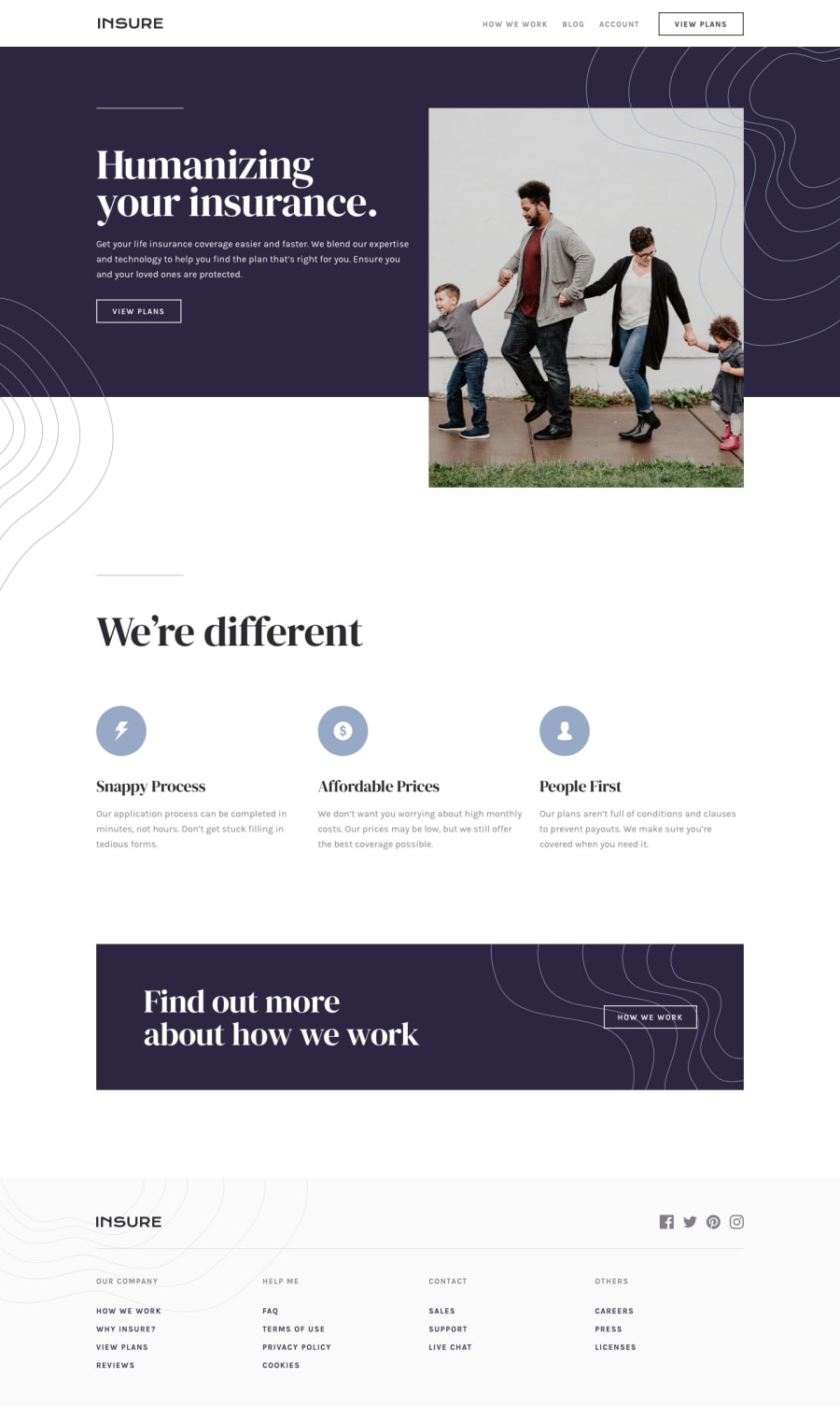
Design comparison
Solution retrospective
Hello everyone, in this challenge I had problem with add pattern on intro image (desktop version).
I created this challenge as mobile first. I wanted to start mobile first. For me is better to start desktop first but of course responsive....I am used for it.
The toggle navigation I did with jQuery.
Happy coding
Community feedback
- @Mr-AzeezPosted 10 months ago
@Luboš Bräth your project looks perfect, it looks amazing. There's just one thing you could add that will make it a lot better. In the we're different section, change the background color to white just like this:
background-color: #fff;. Great work on the project, keep going fam 💯.0@Bredis79Posted 10 months agoHello @Mr-Azeez, thanks for your comment. Why should I add the background color when is already white? Does it have any meaning in some browsers to set background? I didn't set background color because it white:)
Thank you for your time.
0
Please log in to post a comment
Log in with GitHubJoin our Discord community
Join thousands of Frontend Mentor community members taking the challenges, sharing resources, helping each other, and chatting about all things front-end!
Join our Discord
