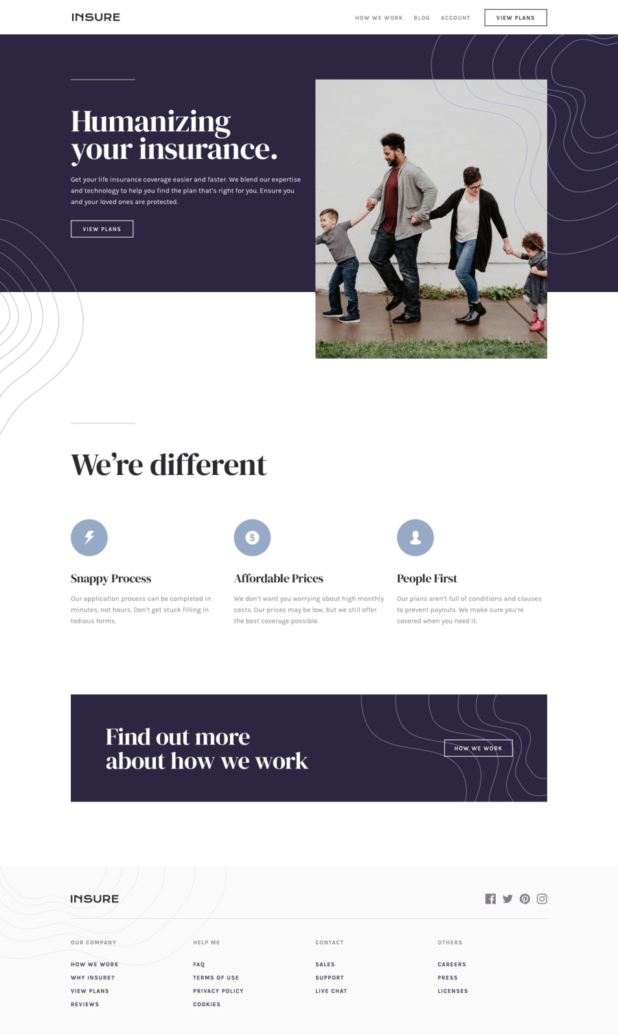
Design comparison
Solution retrospective
It was not as easy as it looked.
Community feedback
- @brasspetalsPosted over 3 years ago
Hi, Pierre! Congrats on submitting another solution! 🎉 Good job overall - it responds nicely!
A few suggestions:
- Using
::beforeand::afterpseudo-elements to place the wavy background patterns in the top sections will make your life much easier. Then you could usez-indexas needed to get them to layer over/under other elements. Speaking of, the #left-bg seems to be oddly positioned for me on mobile, but changingleft: autotoleft: 0seems to fix it. - Instead of using two separate img tags for the header/hero image, I suggest using srcset.
- The only design thing I noticed is that the mobile menu is the wrong color and missing the background pattern/image.
- One last thing, much of the content gets off center on large screens (1920px), so it'd be worth looking into centering all the content of your main.
Marked as helpful2@pierre-pellegrinoPosted over 3 years ago@brasspetals Hi Anna, thanks a lot for your comment !
-
I didn't even know
::beforeand::aftercould do it for me, I'm giving it a try ! -
I had a doubt with the color... I tried the backgrounds violet color but it did not look like the original, I'll fix it ! I'm also still looking for a proper way to display the background image, it shows for really small screens (<390px) but it looked really bad...
I'll be working on these, thank you a lot again for this helpful advice !
0 - Using
- @FarisPalayiPosted over 3 years ago
Your solution looks excellent and responds really well to different screen sizes👏
If you want to improve accessibility a little better, then a few suggestions would be:
- Set the alt text of the image under the
.cardelements and the images that are only used for decorative purpose toalt=""since those images doesn't provide any extra context to users and by setting it empty, assistive technologies can ignore the image. - And also try to add an
aria-labelortitleto social media links. Because, currently, the screen readers can't recognize what kind of link that is.
That's all from me. Have fun coding 👩💻
Marked as helpful2@pierre-pellegrinoPosted over 3 years ago@FarisPalayi Hey Faris, thanks a lot for this comment !
I didn't know you could let the
altattribute empty, I'm going to follow your advice right know and fix those things !Thank you again !
1 - Set the alt text of the image under the
Please log in to post a comment
Log in with GitHubJoin our Discord community
Join thousands of Frontend Mentor community members taking the challenges, sharing resources, helping each other, and chatting about all things front-end!
Join our Discord
