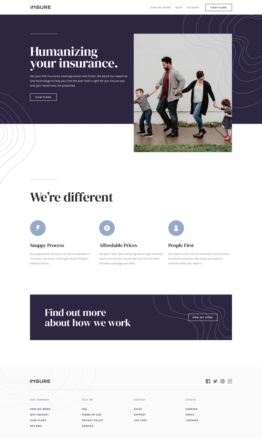
Design comparison
SolutionDesign
Solution retrospective
I finally finished this. It was a tought one for sure. Its not perfect but im really satisfied with the result. I really struggled with the graphics in the intro section, at the desktop design. I took the idea from @ApplePieGiraffe solution haha.
Community feedback
- @ApplePieGiraffePosted almost 4 years ago
Well, hello, Felix Anducho! 👋
Nice to see you complete another challenge! 👍
Good work on this one (I agree that it can be quite tricky)! 😆
I suggest,
- Adding a hover state to the various buttons and navigation links in the page.
- Turning the navigation links in the footer of the page into actual links using the anchor tag.
- Adding
overflow-x: hiddento thebodyto prevent a horizontal scroll bar from appearing along the bottom of the screen in the desktop layout. - One thing you could do that might improve the mobile layout is to allow the hero image to take up 100% of the viewport width but give it a fixed height. Then add
object-fit: coverto the image to make sure that it is cropped and doesn't distort when the screen is resized. That way, there will be no empty space to the sides of the image in the tablet layout. 😉
Keep coding (and happy coding, too)! 😁
1
Please log in to post a comment
Log in with GitHubJoin our Discord community
Join thousands of Frontend Mentor community members taking the challenges, sharing resources, helping each other, and chatting about all things front-end!
Join our Discord
