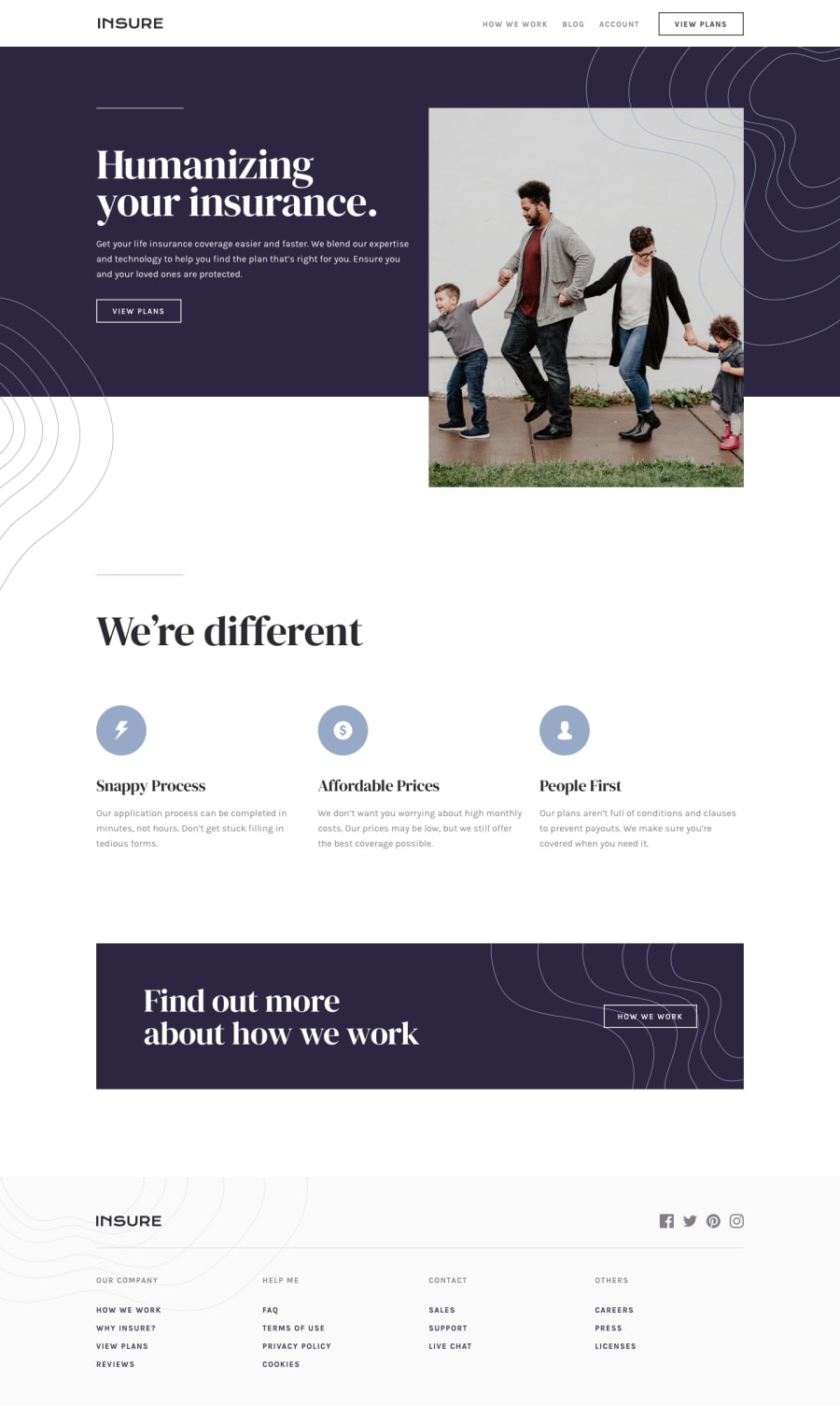
Design comparison
Community feedback
- @grace-snowPosted almost 4 years ago
Hi,
This looks nice overall and is well structured html, so well done. There are a few opportunities to improve it...
The header content is spilling off screen on my mobile, so take a look at that.
I think a lot of your report issues would be solved if you remove the hash from your links - it's looking for anchor links - so swap for a / and I think they'll disappear.
Definitely have another look at alt text. If the only content in a link, it should meaningfully describe where the link goes. Otherwise it should meaningfully describe the image, OR if the image is not important alt attribute should be left intentionally empty so assistive technology knows to skip it.
Other thing I notice is you're getting really bad layout shift on initial page load. To address that, add a width and height attribute to your header/hero image. You may find you need to offer 2+ versions of the image in a srcset, each with different widths/heights. This is a good skill to develop now, as it will affect your site performance results, which have an impact on Google search rankings as well.
Hope all that's helpful, keep going!
1
Please log in to post a comment
Log in with GitHubJoin our Discord community
Join thousands of Frontend Mentor community members taking the challenges, sharing resources, helping each other, and chatting about all things front-end!
Join our Discord
