Submitted almost 4 years ago
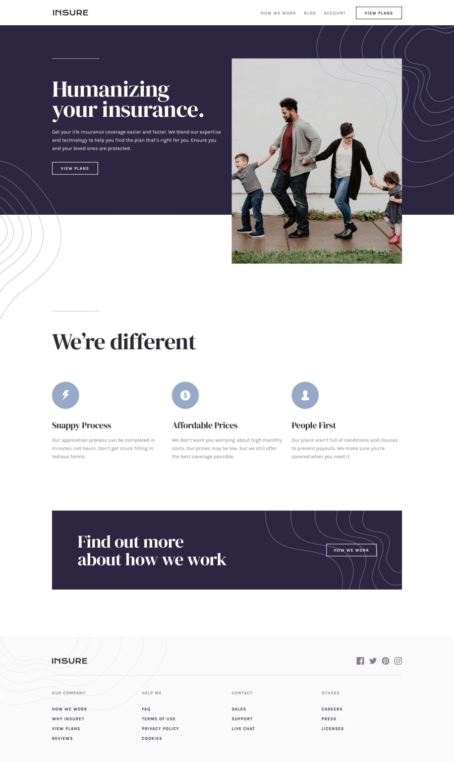
Insure landing page | HTML CSS & JS | Flexbox & Grid
@MasterKrab
Design comparison
SolutionDesign
Solution retrospective
I am just a beginner and would appreciate any feedback.
Do I have good practices? What errors do I have? How could I improve my code?
Thanks <3
Community feedback
- @just-a-devguyPosted almost 4 years ago
Hey! Nice work! I only checked this on mobile and it looked great. I have one suggestion, try to add a little more space between the social icons. Other than that, I saw nothing wrong with it on mobile
2
Please log in to post a comment
Log in with GitHubJoin our Discord community
Join thousands of Frontend Mentor community members taking the challenges, sharing resources, helping each other, and chatting about all things front-end!
Join our Discord
