Insure landing page - HTML, CSS and a little JS for the burger menu
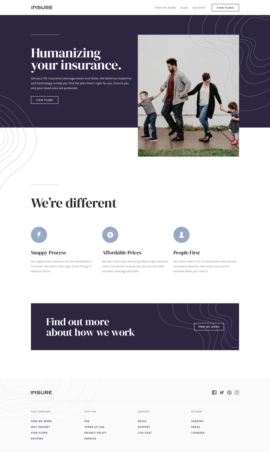
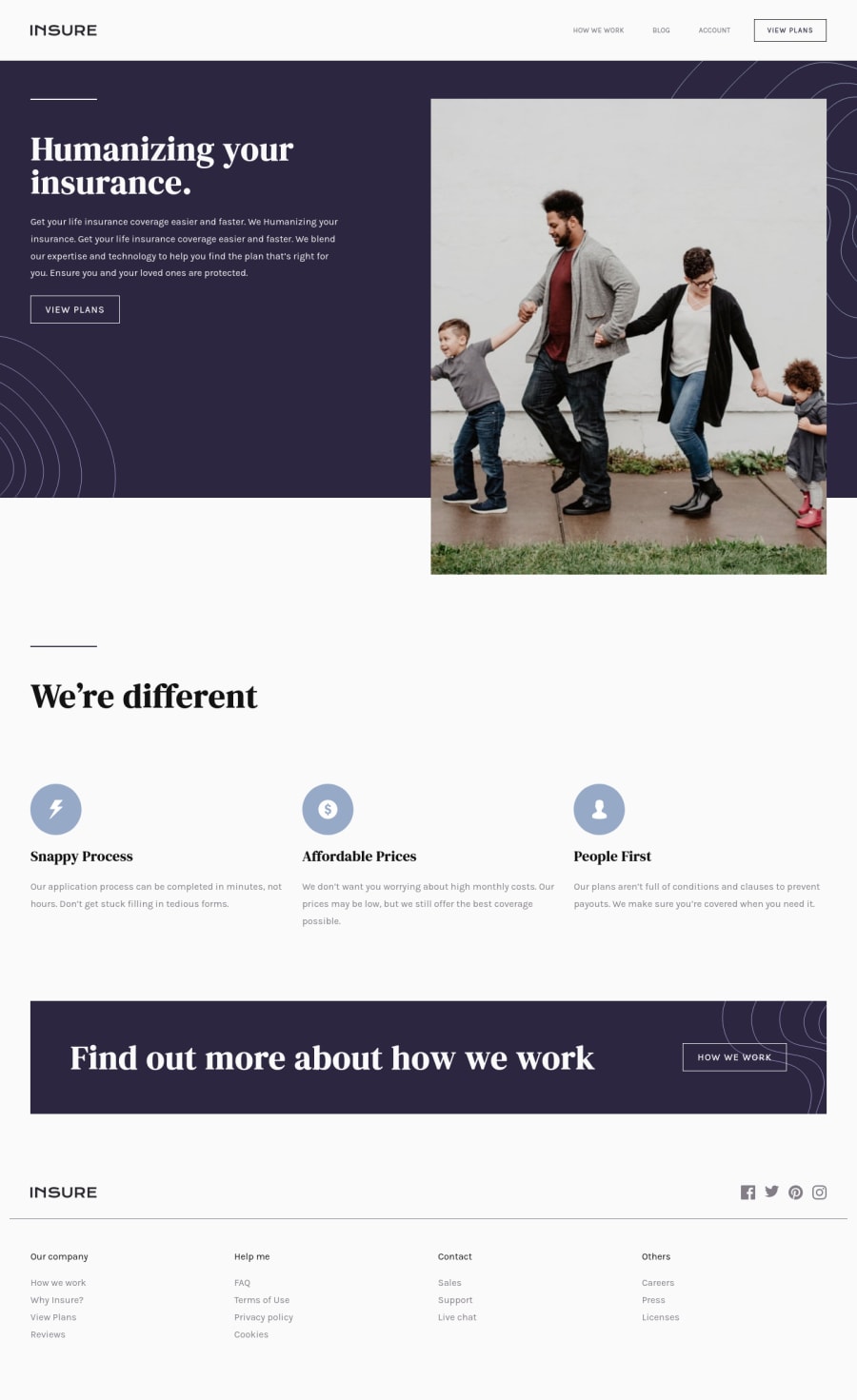
Design comparison
Solution retrospective
I wanted to work on a hamburger menu component that I could use again in other projects I think this one based on Andy Bell's tutorial works well.
I found the top section very difficult to get right (the breakpoint is still not 100% good) especially working with the image. I will try another challenge focusing on images. Any advice on how this could be done better or resources for learning about working with images in layout would be appreciated.
Any other feedback on any points would also be most welcome.
Community feedback
- @ApplePieGiraffePosted almost 4 years ago
Hello there, Dave! π
Good work on this challenge! π You've done a nice job, as usual, (everything looks pretty good and responds rather well)βand I like the spinning animation you added to the mobile menu icon (just add something like
overflow: hidden
to thebody
when the navigation is toggled)! πA few things I'd like to suggest are,
- Increasing the size of the text of the navigation links in the footer of the page in the desktop layout (they are quite small, at the moment).
- Adding
overflow-x: hidden
to thebody
to get rid of a horizontal scroll bar that is showing up along the bottom of the screen in the desktop layout. - Typically, vertical scrolling is disabled when the mobile navigation is toggled so that users can just focus on the options they have available to them (and I think things feel a little out of place if you are able to scroll down since now part of the page is covered by the menu and you to disable it anyway in order to access the rest of the content on the page). As long as there is a clear way to disable the mobile menu (so that users can easily exit out of it), I think disabling vertical scrolling when the mobile navigation is toggled would be a nice idea! π
Of course, keep coding (and happy coding, too)! π
2@dwhensonPosted over 3 years ago@ApplePieGiraffe thanks as always for the tip top feedback. Much appreciated.
Both you and @uzoway have the same feedback on the nav so Iβll look into that.
Iβm about to start reviewing some of my recent challenges and updating them with the feedback I received so Iβll put this one on the list.
Thanks again!
1 - @uzowayPosted almost 4 years ago
I just posted screenshots of what I mean
1@dwhensonPosted almost 4 years ago@uzoway thanks! I can see what you mean now.
I think I'm OK with users being able to scroll down from the mobile nav. I wanted to keep the functionality as much like a desktop nav as possible - so users aren't trapped in it.
Also position fixed would bring some other problems as the top of the nav (the part with the logo and nav button) is not part of the pop-up but just the original nav. I'll have a think how I could go about addressing this.
Thanks! Appreciate the feedback.
0 - @uzowayPosted almost 4 years ago
Hello Dave! I just visited the site(on mobile) and I must say you did well. Although, there's something I'd like to point out. On the mobile layout, the hamburger and Mobile navigation page is only accessible on the first page. I think it should be fixed(position) so that at any point on the page, one can easily navigate the site.
I'm actually working on this challenge and you just motivated me to finish itπ
1@dwhensonPosted almost 4 years ago@uzoway thanks for the feedback. Iβm a bit confused though about the mobile nav issue. I thought there was only one page to this challenge ??? Can you clarify what I missed please.
0
Please log in to post a comment
Log in with GitHubJoin our Discord community
Join thousands of Frontend Mentor community members taking the challenges, sharing resources, helping each other, and chatting about all things front-end!
Join our Discord