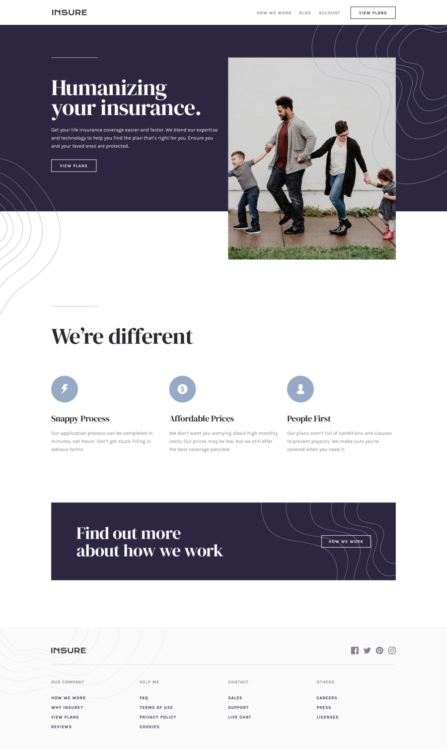
Design comparison
Solution retrospective
I will appreciate feedback, especially on the responsiveness, contrast and any other aspect.
Community feedback
- @awwmickyPosted over 4 years ago
Overall, solid work 🔥! I also like your hover effect on the buttons, hero section size, mobile navbar effect, & the smaller interaction effects.
Here are some critiques to check out:
-
add some more top margin/padding on the service section, e.g. "we're different"
-
adjust the font size on the service section & secondary section
- e.g: "snappy process, ...", "find out more..."
-
add some more bottom margin/padding on the secondary section, e.g. "find out more..."
-
for mobile responsiveness, the horizontal scroll may be popping up b/c of the padding/width (it makes the screen buggy)
- may adjust the
navwidth: 97.25vw
- may adjust the
good work!
https://www.frontendmentor.io/solutions/insure-landing-page-html-css-flexbox-variables-QbcNO01Cj/preview
1@Dev-SoksPosted over 4 years ago@awwmicky Thanks, I appreciate the feedback, I will definitely work on it.
1 -
Please log in to post a comment
Log in with GitHubJoin our Discord community
Join thousands of Frontend Mentor community members taking the challenges, sharing resources, helping each other, and chatting about all things front-end!
Join our Discord
