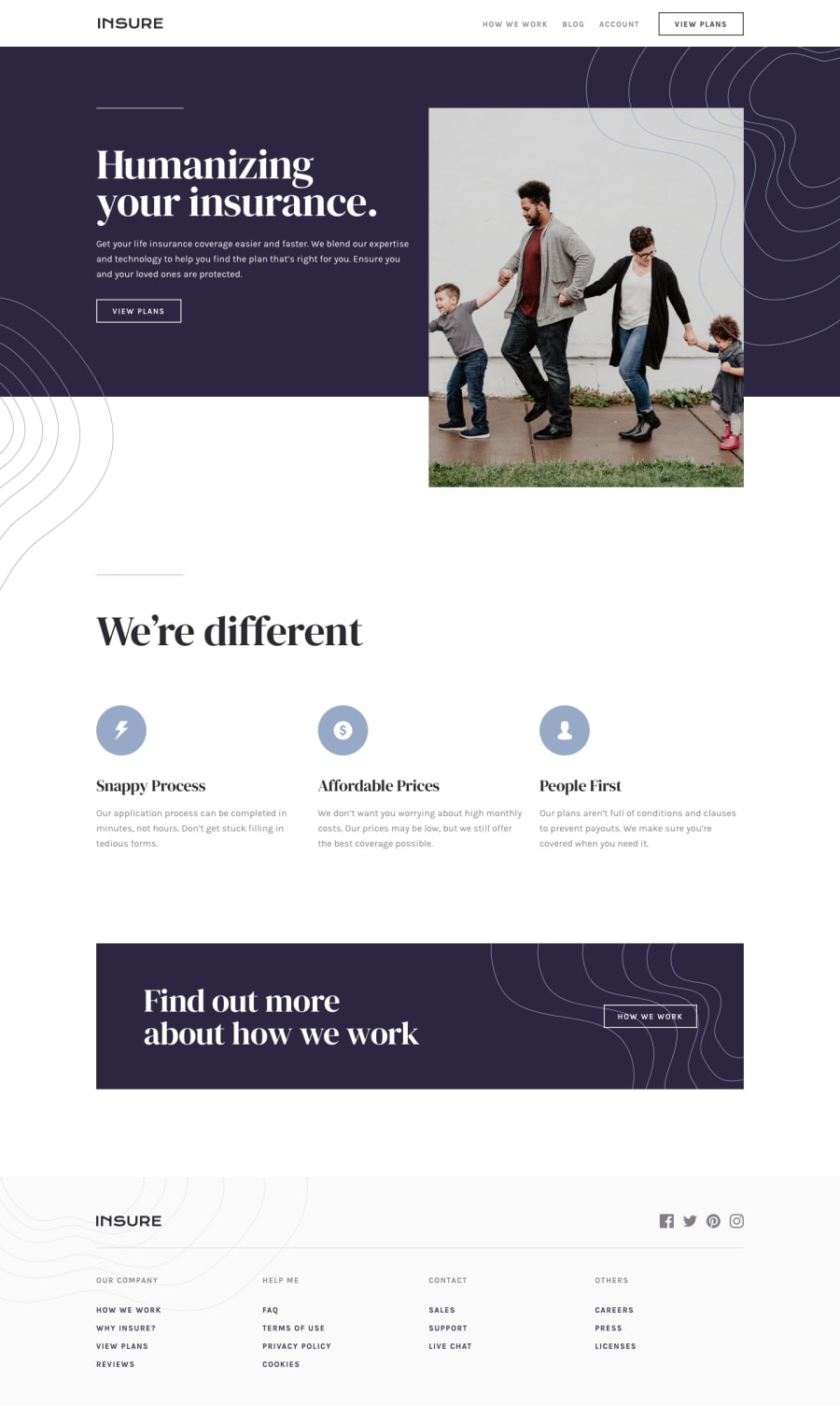
Insure Landing Page using HTML SCSS JS
Design comparison
Solution retrospective
Good Evening Mentors 🙋♂️
Here is my solution to the Insure Landing Page challenge.
I've used HTML, SASS and Vanilla JavaScript to complete the challenge. The design is pretty simple, so didn't took me long to finish.
I came across some specificity issues trying to style the anchor tags correclty. And in some places had to use the css :not() psuedo selector to make the style work. 😅
Also this my first project where I build a mobile Hamburger Menu, I tried to make it as accessible as I could and I am happy with the results.
Didn't use any scroll animation or transition effect on this project, kept it simple.. might add it later when i get some free time 😭😬
Please let me know your thoughts about this and help me improve 🙇
Thankyou in advance ❤️
Community feedback
- @finkenmannPosted about 2 years ago
Wow! I had so much troubles to find solutions with the background files, placed to the correct container and you did all so well. Your code is the perfect inspiration and answerd all my questions i had. Like the solutions you did between mobile and desktop design. I didn’t came to the clue, to build a .main container around the hero, features and cta section. But afterwards, if I see a good solution, it all looks so easy ;-)
1@snehamoybagPosted about 2 years ago@finkenmann Thank you for the kind words and for sharing your experience. I'm glad to hear that my code was able to help you in some way :)
0
Please log in to post a comment
Log in with GitHubJoin our Discord community
Join thousands of Frontend Mentor community members taking the challenges, sharing resources, helping each other, and chatting about all things front-end!
Join our Discord
