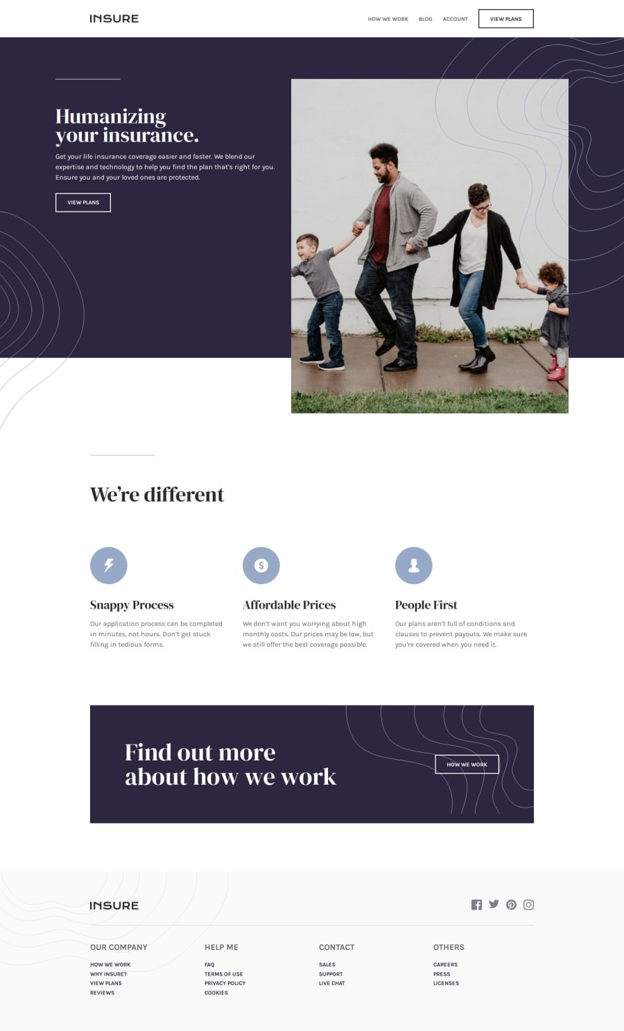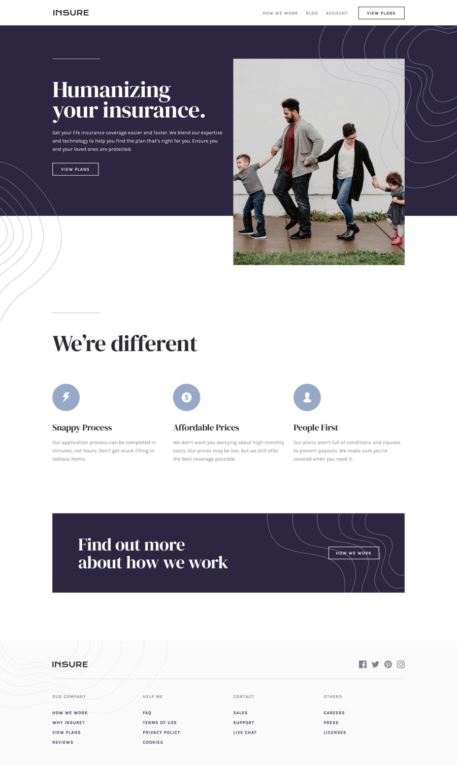
Design comparison
SolutionDesign
Solution retrospective
What are you most proud of, and what would you do differently next time?
I'm happy that I managed to get everything just about right! I got to use many different tools, some of which I use on every project:
- Custom Properties for colors and typography
- Grid
- Media Queries
- Creating space between elements using the
.flow > * + *utility class - Using modern CSS selectors like
:isand:has - Selecting and manipulating DOM elements using functions and event listeners
And some I haven't used too much yet:
.containerutility class that sets amax-width,padding-inlineandmargin-inline: auto.- Setting up a
gapCustom Property for cohesive spacing - I just invested in Frontend Mentor Pro, and the Figma file gives you everything you need! - Setting up font sizes using numbers, with
400as the "base".
Positioning the background patterns at the top was tricky. I ended up using ::before and ::after pseudo-elements.
I am happy to hear any feedback :)
Community feedback
Please log in to post a comment
Log in with GitHubJoin our Discord community
Join thousands of Frontend Mentor community members taking the challenges, sharing resources, helping each other, and chatting about all things front-end!
Join our Discord
