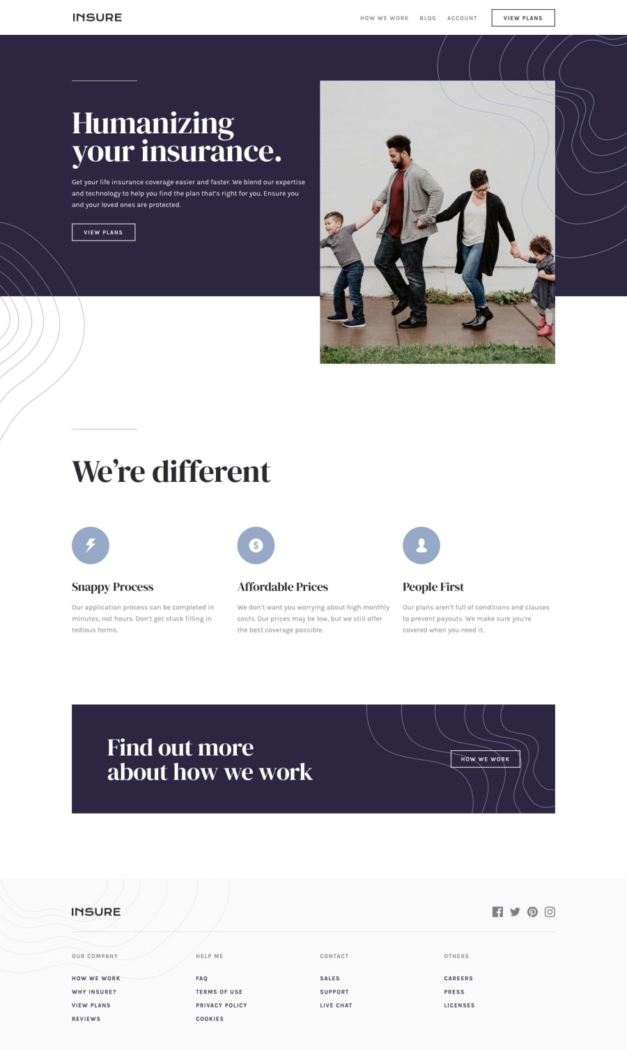
Design comparison
SolutionDesign
Solution retrospective
Done! :D Loved this challenge As always, any feedback is welcome <3
Community feedback
- @ApplePieGiraffePosted over 3 years ago
Greetings, yet again, Aaron Gonzalez! 👋
Well done on this challenge! 👍 I love this challenge, too (it is one of my favorites, actually)! 😆
I'd like to suggest,
- Turning the navigation links and the social media icons in the footer of the page into actual links using the anchor tag.
- Not switching to a mobile-friendly layout right at 1199px, as there's still quite a bit of room for the desktop layout or an intermediary/tablet layout and to prevent there from being too much empty space to the sides of the content right when the layout changes.
Also, as a tip, you don't have to write the text for the navigation links in the footer of the page in all caps in your HTML. You can simply write it normally and then just add
text-transform: uppercaseto the<li>s in your CSS. 😉Keep coding (and happy coding, too)! 😁
0
Please log in to post a comment
Log in with GitHubJoin our Discord community
Join thousands of Frontend Mentor community members taking the challenges, sharing resources, helping each other, and chatting about all things front-end!
Join our Discord
