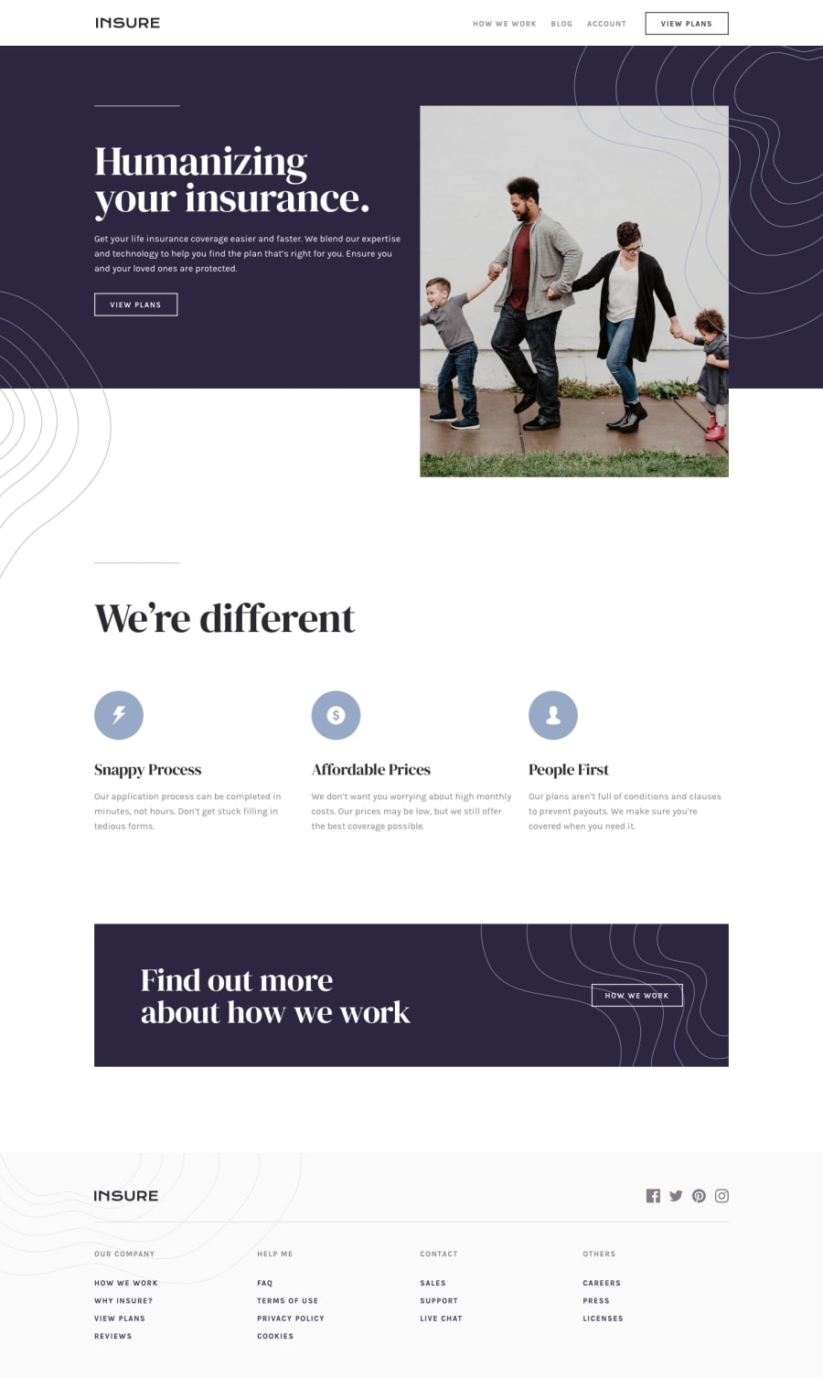
Design comparison
Solution retrospective
Hello , this is my first time using calc(), i found it in a video on youtube and i was trying to use on my project, it's useful, but i'll try to do my best in the future using it. *Second, I don't know why my boton view plans doesn't work when i'm try using css, i think i've done something wrong. *Third, The upper right spirals do not overlap in the image, i try to add the z-index, but it did not work
Any feedback is welcome!
Community feedback
- @pikapikamartPosted about 3 years ago
Hey, awesome work on this one. Layout in desktop looks really wide and it is shorter than the design and the paddings are not consistent. it is responsive though which is great and the mobile state looks great.
Some suggestions would be:
- On this one, you should have used a markup that looks like:
<header /> <main /> <footer />
This way, all element that has content are inside their respective landmark elements.
nav
should be inside theheader
since it is usually associated to it since it is on the top most part of the site.- Website-logo
img
should be using the website's name as thealt
likealt="pod"
. Remember that a website's logo is meaningful so always make sure it uses the properalt
value. - Also when using
alt
attribute, avoid using words that relates to "graphic" such as "logo" and others. Animg
is already an image/graphic so no need to describe it as one. - navlinks should be using each their own
a
tag since those are supposed links. Remember that interactive components must use interactive elements, also why are you includingcursor: pointer
for those? Just usea
tag :> - You could have use those spirals as well as a
background-image
. - Your first
::before
must just use a lowerz-index
because right now, it is overlapping the button. Try to hover on thebutton
on the hero-section, you can't right, because the spiral is blocking it. Set a lowerz-index
on the::before
and on the.human__conte__text
add:
position: relative; z-index: must be higher on the ::before
- I would make the hero-section image an
img
since it is meaningful since it portrays like a secured family because of the insurance coverage. - Avoid using multiple
h1
on a page, use only at least 1 per page so change those into other heading tags. - Those 3 icons are only decoration. Decorative image must be hidden at all times for screen-reader users by using
alt=""
and extraaria-hidden="true"
attribute on theimg
tag. - When using heading tag, make sure you aren't skipping a level. If you use
h3
make sure thath1, h2
are present "before" it. - Also, instead of
button
for those things that looks-a-button, usea
tag on them since they will be more likely a page transition for the user to see what those includes.
MOBILE
- Same for the website-logo it should use the website name as the
alt
value. - Social media links could be inside
ul
since those are "list" of links. - Each
a
tag that wraps social media, it should have eitheraria-label
attribute or screen-reader element inside it. The value for whatever method you will use should be the name of the social media likearia-label="facebook"
on the facebook linka
tag. This way, users will know where this link would take them. - You should have used a single
nav
to contain all those list of links on below since they are all related. Then maybe a list of list for each. - Also, again, why are you not using
a
tag for those if you are making them interactive by addingcursor: pointer
?
MOBILE
- Hamburger menu should be using a
button
element since it is a control. Again, interactive components uses interactive elements. By usingdiv
you are making it not-accessible.
SUPPOSING BUTTON IS USED
- The
button
will be using the method I mentioned usingaria-label
attribute or screen-reader element inside. The value will describe what does thebutton
do. The value could bearia-label="navigational dropdown menu"
. - The
button
should have a defaultaria-expanded="false"
attribute on it. It will be set totrue
if the user toggles thebutton
. Have a look at this simple hamburger dropdown of mine
Aside from those, great job again on this one.
0
Please log in to post a comment
Log in with GitHubJoin our Discord community
Join thousands of Frontend Mentor community members taking the challenges, sharing resources, helping each other, and chatting about all things front-end!
Join our Discord