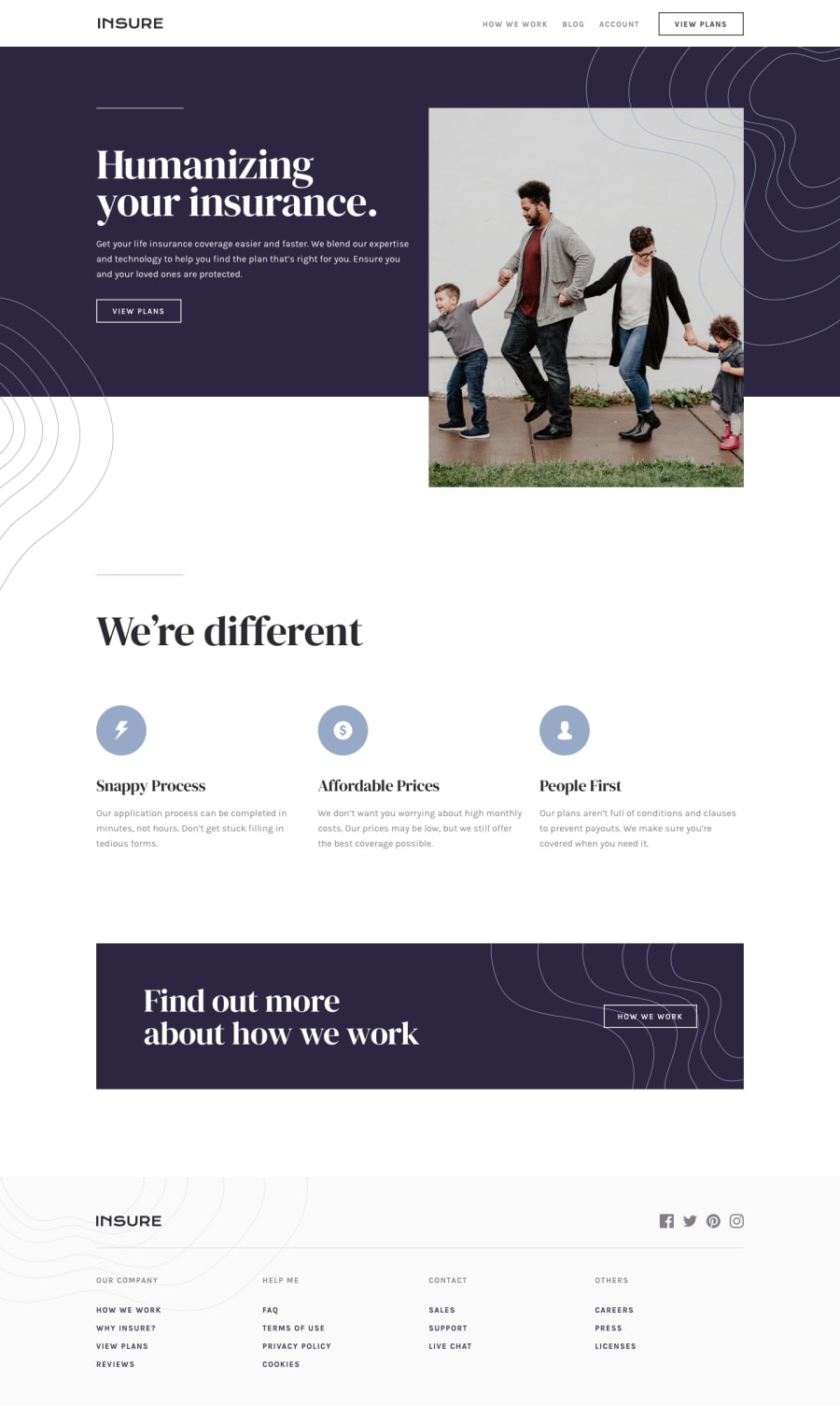
Design comparison
Solution retrospective
This Challenge has been very challenging for me. I have not found a solution how to correctly map the Hero area "Humanizing your insurance" for mobile and desktop. Problem 1: How do I place the containers correctly so that the same code works for mobile and desktop. Problem 2: The white space below the dark background. Do I need another empty container? Problem 3: How to set the background images correctly? One is above the image, the left one is growing to the second page element? I couldn't found a html structure to build this in my project. The transition from two-column to one-column does not work correctly either. What I also have trouble with is writing consistent CSS code. Many elements do not react identically. One time a title has a line, then it doesn't. Once the line is only there in the mobile design, then again not. I wonder if that's how it's supposed to be, or just not consistent designed? Here many questions remain open with me. I hope, by publishing this work, to look at some solutions or to get some help that will bring me further.
Join our Discord community
Join thousands of Frontend Mentor community members taking the challenges, sharing resources, helping each other, and chatting about all things front-end!
Join our Discord
