Submitted over 2 years ago
Insure Landing Page built with HTML, CSS & JavaScript
@danielswift10
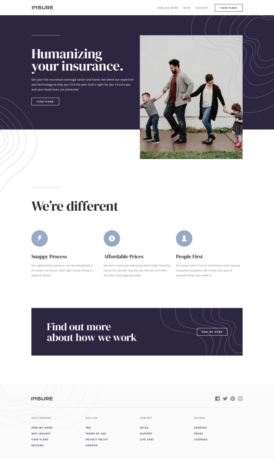
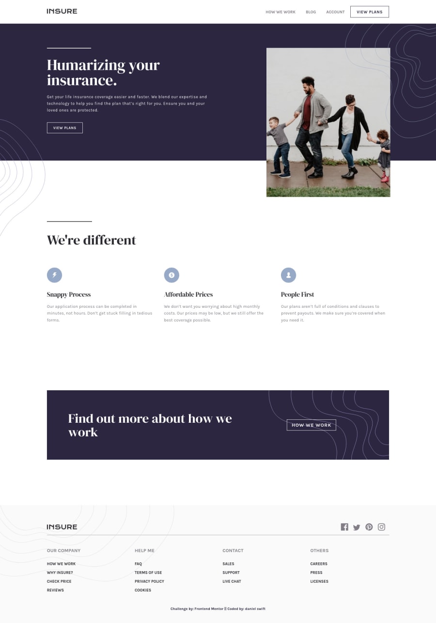
Design comparison
SolutionDesign
Solution retrospective
F33dback is w3lcom3d.
Happy Coding!!!
Community feedback
- @PhoenixDev22Posted over 2 years ago
Hello dAnIeL sWiFt,
First of all, Congratulation on completing this challenge and awesome work on this one. I have few suggestions regarding your solution:
- The alternate text of the logo should not be empty, it may set alt=”Insure". Use the website's name as an alternate text.
- The same for the footer logo. Remember that a website-logo is one of the most meaningful images on a site so use proper alt for it. Use the website's name as an alternate text alt="insure".
- It’s not recommended to add event listener on non-interactive elements. You can use a
<button>
with type=”button”.
- The button needs to have an
aria-label attribute or an
sr-only`` text that describes the button purpose.` For example, you can have: aria-label='Mobile Navigation Trigger' or 'Open Menu.’
- Adding
aria-expanded
that, the user will be able to know that the button content is expanded or collapsed. At first, it has the “false” as a value then you use JavaScript to change the value.
- You should use
aria-controls
attribute on the toggle element, it should reference theid
value of the ``<ul> ```element.
- Don't capitalize in html, let css text transform take care of that. Remember screen readers won't be able to Read capitalized text as they will often read them letter by letter thinking they are acronyms.
- Use the
<nav >
landmark to wrap the footer navigation witharia-label=”secondary “
oraria-label=”footer”
. A brief description of the purpose of the navigation, omitting the term "navigation", as the screen reader will read both the role and the contents of the label. The nav element in the header could use anaria-label="primary"
oraria-label=”main”
attribute on it. The reason for this is that, you should add thearia-label
for anav
element if you are using the nav more than once on the page. This will make it unique.you can read more in MDN
- Relating to the use of the
<hr>
, if you wish to draw a horizontal line, you should do so using appropriate CSS.
- Instead of using a generic div to wrap the footer navigation links , you put your links within an unordered list structure so that a screen reader will read out how many things are in the list to give visually impaired users the most information possible about the contents of the navigation.
- The social links wrapping the icons must have
aria-label
orsr-only
text indicate where the link will take the user. Then you setaria-hidden =”true”
andfocusable=”false”
to the svgs to be ignored by assistive technology .
<svg aria-hidden="true" focusable="false"> ... </svg>
- Adding
rel="noopener"
orrel="noreferrer"
totarget="_blank"
links. When you link to a page on another site usingtarget=”_blank”
attribute , you can expose your site to performance and security issues.
The github repo is not found. I have used the devtools inspect to check your solution.
Aside these, Great work! Hopefully this feedback helps.
0
Please log in to post a comment
Log in with GitHubJoin our Discord community
Join thousands of Frontend Mentor community members taking the challenges, sharing resources, helping each other, and chatting about all things front-end!
Join our Discord