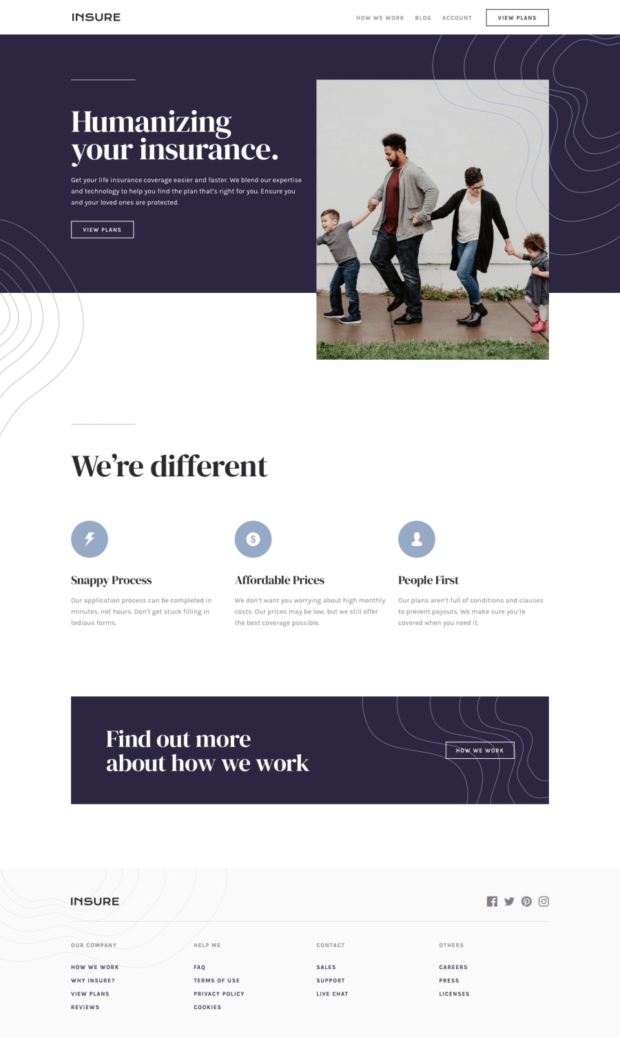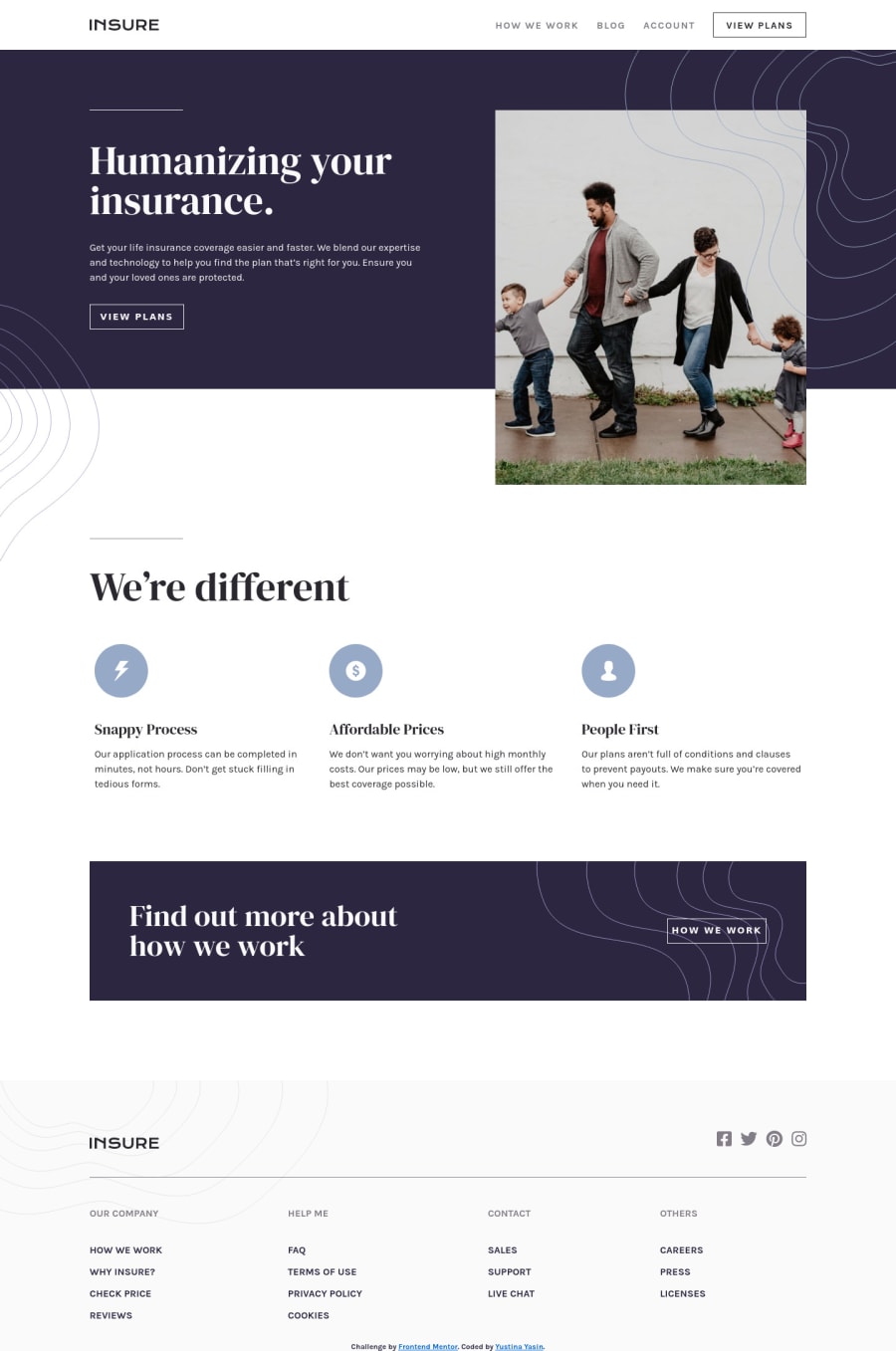
Design comparison
Solution retrospective
I still have some problems like:
- there is a little gap between the first photo in mobile version and the next content. Slightly visible between the photo and the pattern
- in the desktop version, the introduction part there are 2 background. The top right background need an overflow hidden but the other one doesn't so I need to put the other background into main
- the navbar in the mobile version is not yet fixed
any feedbacks are welcome
Community feedback
- @brasspetalsPosted almost 4 years ago
Hi, Yustina! 👋
Good job and congrats on completing this challenge! I think I may be able to help you out with your questions, as well as give a few other suggestions to make your solution even better.
-
I’m also not quite sure what is causing the small gap in the mobile intro section. Adding
margin-top: -5px
to your.content
should fix it, however. -
I suggest trying out
::before
and::after
pseudo-elements with absolute positioning to place the curvy patterns for the intro sections. I think it makes placing them a bit easier. -
Adding
overflow-y: hidden
to thebody
while the mobile menu is open will prevent the scrolling issues. -
From 1025px - 1225px width, the intro image overlaps the text content, so you may want to think about adding different styling for medium widths. Maybe play around with the width value of the image and/or reduce the font sizes of the content.
-
On the desktop version of your
.closing
, the background image doesn’t quite fill the container. Addingbackground-size: contain
should fix this. -
Your footer menu should contain links not just list items. Using
a
tags around the text inside theli
tags would be more semantically correct, and you could also add the hover styles to match the design.
Let me know if you have more questions and happy coding!
2@yustinayasinPosted almost 4 years ago@brasspetals thank you so much. I will update the solution
0 -
Please log in to post a comment
Log in with GitHubJoin our Discord community
Join thousands of Frontend Mentor community members taking the challenges, sharing resources, helping each other, and chatting about all things front-end!
Join our Discord