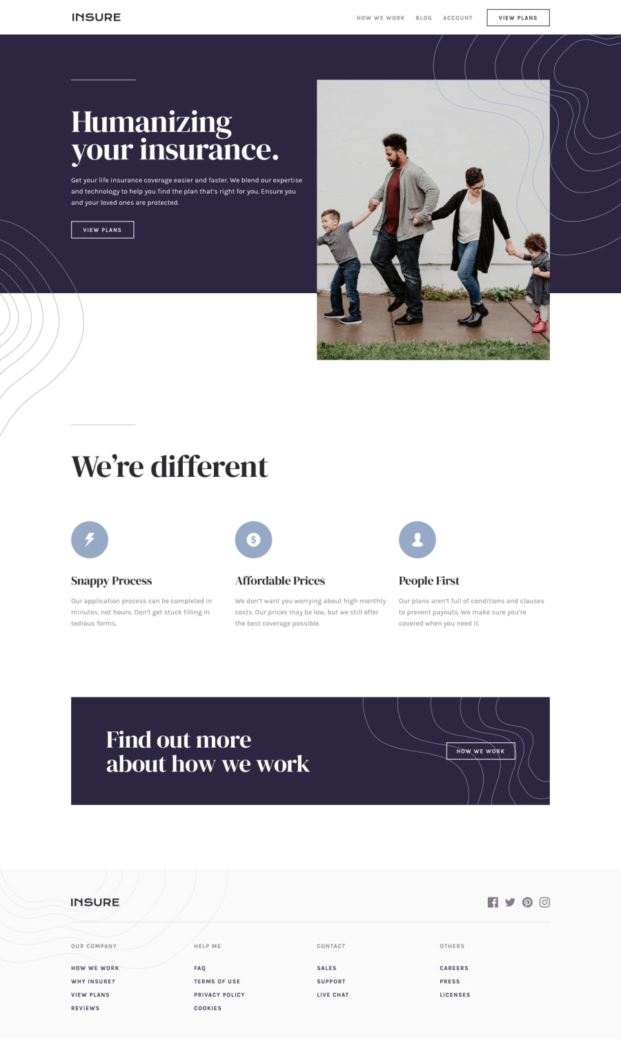
Design comparison
Solution retrospective
I had no idea what to do with the hero image from mobile to desktop layout so i tried a little trick but the backgrounds on the left don't touch exactly :(
I had troubles figuring out the correct HTML structure to easily transition from the mobile state to the desktop. Is the image on the desktop version supposed be positioned absolutely? Since its in the middle of the purple background and the white one?
I kinda managed to achieve the design but i used a little hack with pseudo-elements to keep the purple background, so it should be refractored once i understand how it should work
Any other feedback is appreciated!
Community feedback
Please log in to post a comment
Log in with GitHubJoin our Discord community
Join thousands of Frontend Mentor community members taking the challenges, sharing resources, helping each other, and chatting about all things front-end!
Join our Discord
