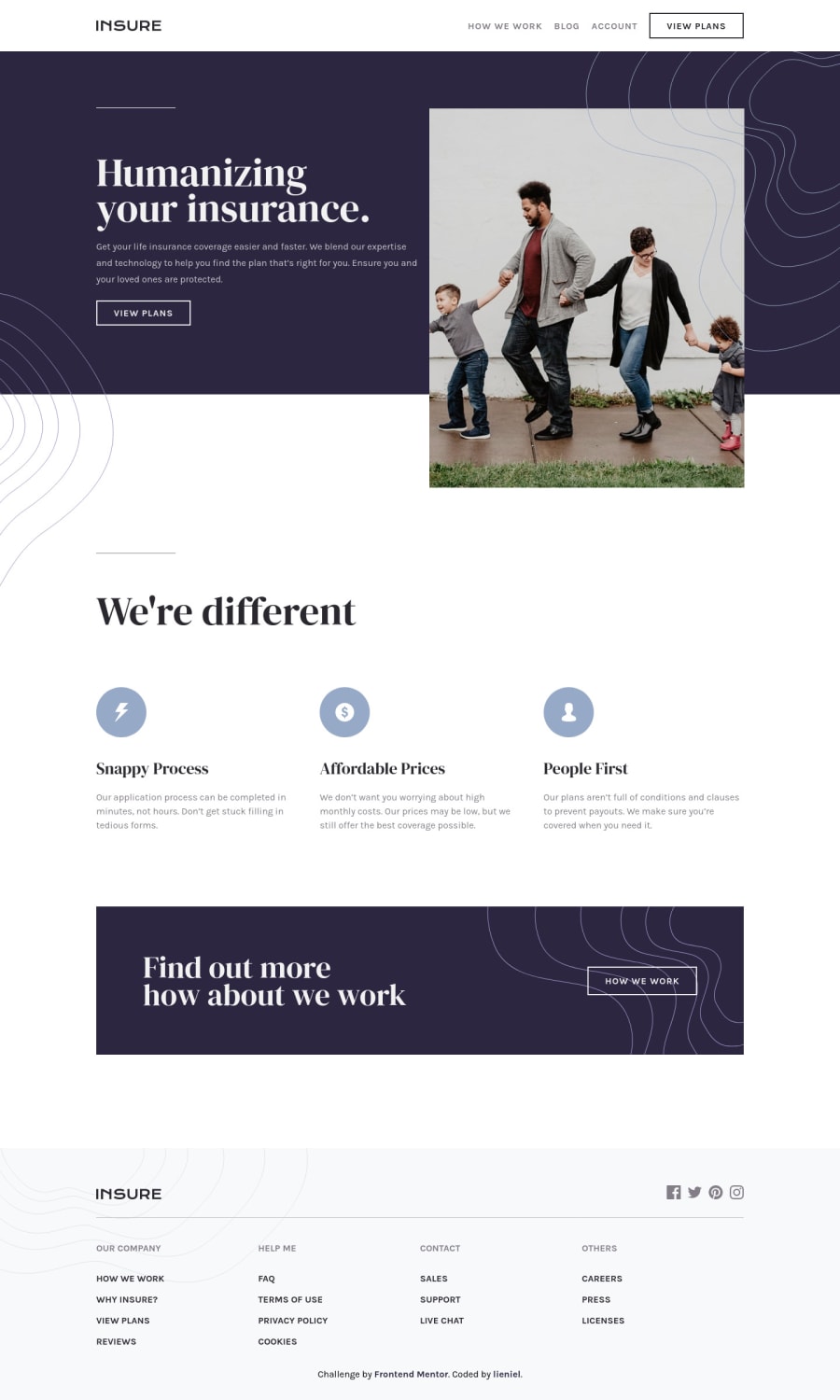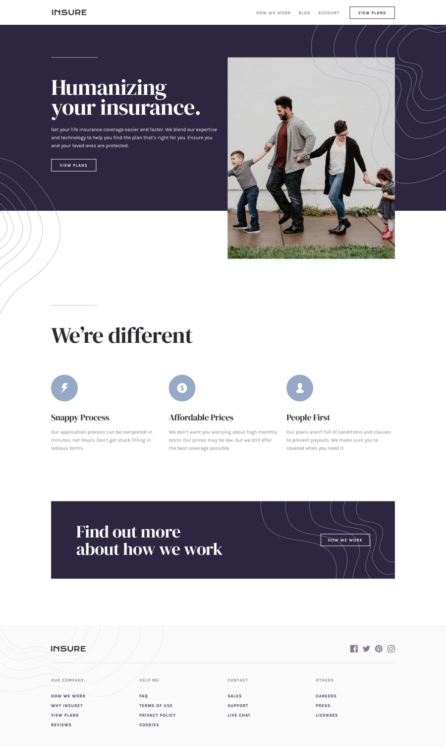
Design comparison
Solution retrospective
Just practicing my CSS layout skill. I realized from my previous challenges that I was too focused on learning Javascript that I was neglecting some basic knowledge. I'm still planning to do more of these kinds of challenges until I'm comfortable with my skills.
If you have any suggestion, feedbacks and tips, don't go easy on me. It really helps. Thaaaaanks.
Please log in to post a comment
Log in with GitHubCommunity feedback
- @AdrianoEscarabote
Hi lieneil, how are you?
I really liked the result of your project, but I have some tips that I think you will enjoy:
- every Html document must contain the main tag, so we can identify the main content, to fix this, wrap all the content with the main tag. HTML5 landmark elements are used to improve navigation experience on your site for users of assistive technology.
- The links must have an aria-label or sr-only text that tells where the link navigates the user. For example: Visit our Facebook. For images, you should set aria-hidden=” true” to be ignored by screen readers and to avoid redundancy and repetition.
The rest is great!
I hope it helps... 👍
Marked as helpful
Join our Discord community
Join thousands of Frontend Mentor community members taking the challenges, sharing resources, helping each other, and chatting about all things front-end!
Join our Discord
