

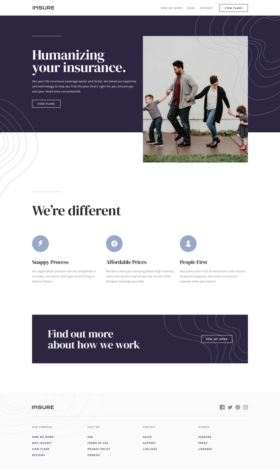
Design comparison
Solution retrospective
🚀 Excited to Share My Latest Project: A Responsive Insure Landing Page! I’m thrilled to showcase a recent project I’ve been working on—a fully responsive landing page for Insure, a fictional insurance company. This project was a fantastic opportunity to dive deep into HTML, CSS, and JavaScript while focusing on creating a seamless user experience across all devices. Here’s a quick breakdown of what I implemented: ✅ Fully Responsive Design: Mobile-first approach with smooth transitions and animations. Media queries to ensure the layout adapts perfectly to desktops, tablets, and mobile devices. ✅ Interactive Features: A dynamic hamburger menu for mobile navigation with smooth opening and closing animations. Overlay background for better focus on the navigation menu. Escape key functionality to close the menu for improved accessibility. ✅ Modern Design Elements: Custom patterns and icons to enhance the visual appeal. Smooth scroll animations using the Intersection Observer API to bring the page to life. ✅ Clean and Maintainable Code: Organized CSS with variables for consistent styling. Modular JavaScript for easy scalability and maintenance. This project was a great way to practice front-end development fundamentals while also exploring advanced techniques like intersection observers and responsive design patterns. I’m proud of how it turned out, and I’m excited to keep building and refining my skills!
What challenges did you encounter, and how did you overcome them?I encountered problem in a overlay but I overcome it.
What specific areas of your project would you like help with?Feel free to provide me a feedback
Community feedback
Please log in to post a comment
Log in with GitHub
Join our Discord community
Join thousands of Frontend Mentor community members taking the challenges, sharing resources, helping each other, and chatting about all things front-end!
Join our Discord