Design comparison
SolutionDesign
Solution retrospective
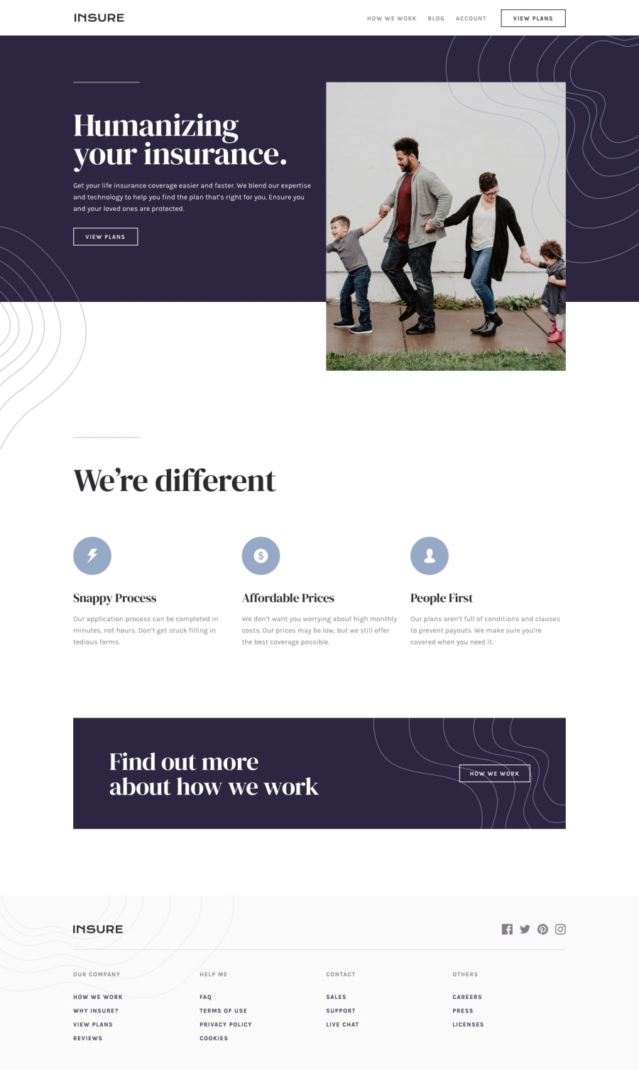
Hey Guys, I just finished the Insure Landing Page Challenge. I would like you all to see it and let me know how I can improve it. Let me know my mistakes . Thank you!.
Community feedback
- @arkharman12Posted almost 3 years ago
- Responsive breakpoint comes bit early in my opinion, try going to at least tablet size screens.
- Position of the first image could also be improved since the kids are hidden at one point.
Good luck! 👏
Marked as helpful0@karishma-devPosted almost 3 years agoHi @arkharman12 , I have modified the code, I hope it looks better now. :)
Thank you for you suggestion. <3
0
Please log in to post a comment
Log in with GitHubJoin our Discord community
Join thousands of Frontend Mentor community members taking the challenges, sharing resources, helping each other, and chatting about all things front-end!
Join our Discord
