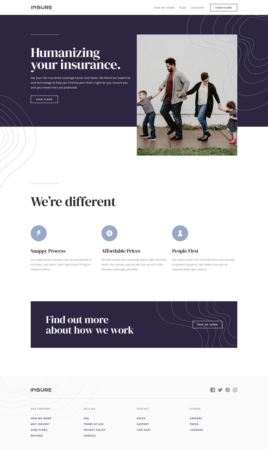
Design comparison
SolutionDesign
Solution retrospective
Enjoyed while making this project, any suggestion is welcome. Happy Coding!!
Community feedback
- @JaneMorozPosted about 2 years ago
Hey! Your solution to this challenge is awesome!
The only things I've noticed:
- If you use button/link without any text (or with only image), I suggest to add
aria-labelto the <button> (or <a>) tag to improve accessibility. You can read more about it here. For example:
<a aria-label="my pinterest" href=""> <img src="images/icon-pinterest.svg" alt=""></a>- Also I have some weird hover effect when I hover over header's "View Plans" button.
Keep it up! And good luck 🍀
0@dev-mksinghPosted about 2 years ago@JaneMoroz hey thanks for the appreciation, yea i totally forgot about aria and to change to text color from
view plansbutton in header. Gonna update it straight away. Thanks again.1 - If you use button/link without any text (or with only image), I suggest to add
Please log in to post a comment
Log in with GitHubJoin our Discord community
Join thousands of Frontend Mentor community members taking the challenges, sharing resources, helping each other, and chatting about all things front-end!
Join our Discord
