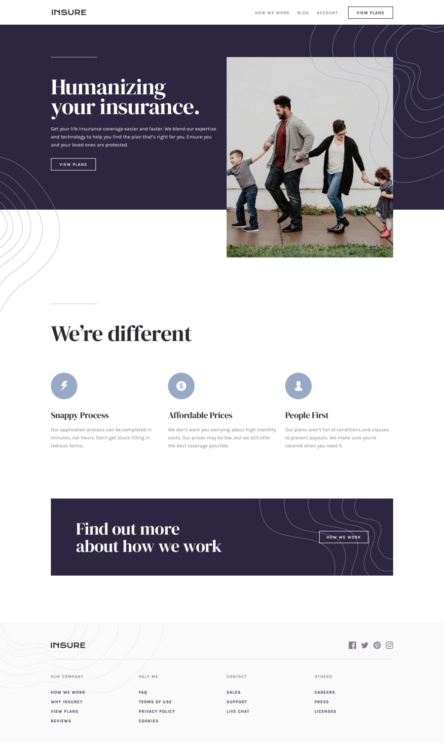
Design comparison
SolutionDesign
Community feedback
- @rfilenkoPosted over 4 years ago
Hi there, good job, but noticed few things:
- usually there should be only one h1 tag on the page;
- buttons should be <button> tag, not divs;
- no main tag on the page;
- add object-fit: cover; for proper image proportions;
- social icons should be probably links;
Cheers, Roman
1@leoikeh99Posted over 4 years ago@rfilenko well noted, i'll be sure to keep those rules in mind next time.
0
Please log in to post a comment
Log in with GitHubJoin our Discord community
Join thousands of Frontend Mentor community members taking the challenges, sharing resources, helping each other, and chatting about all things front-end!
Join our Discord
