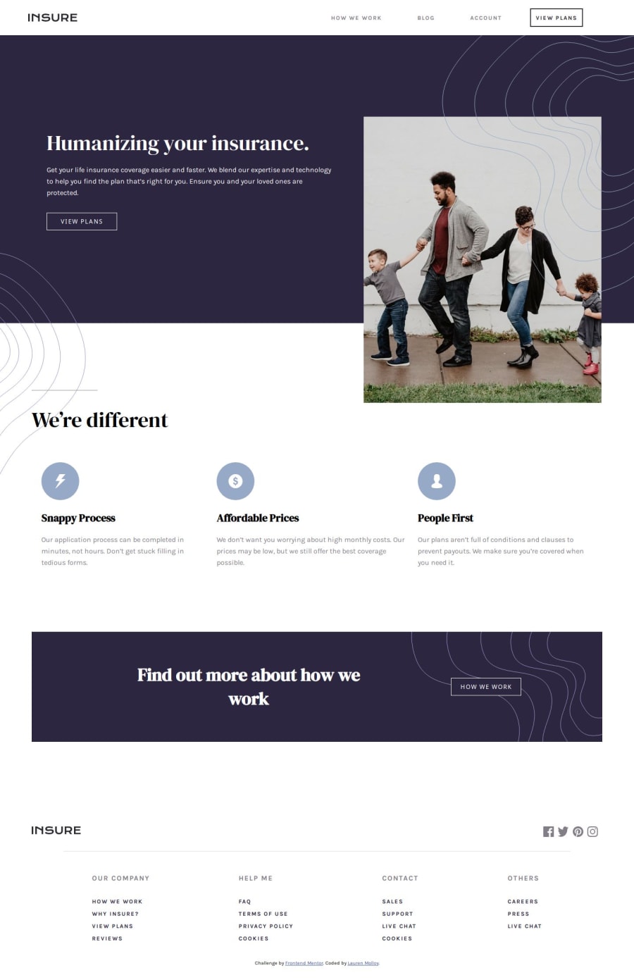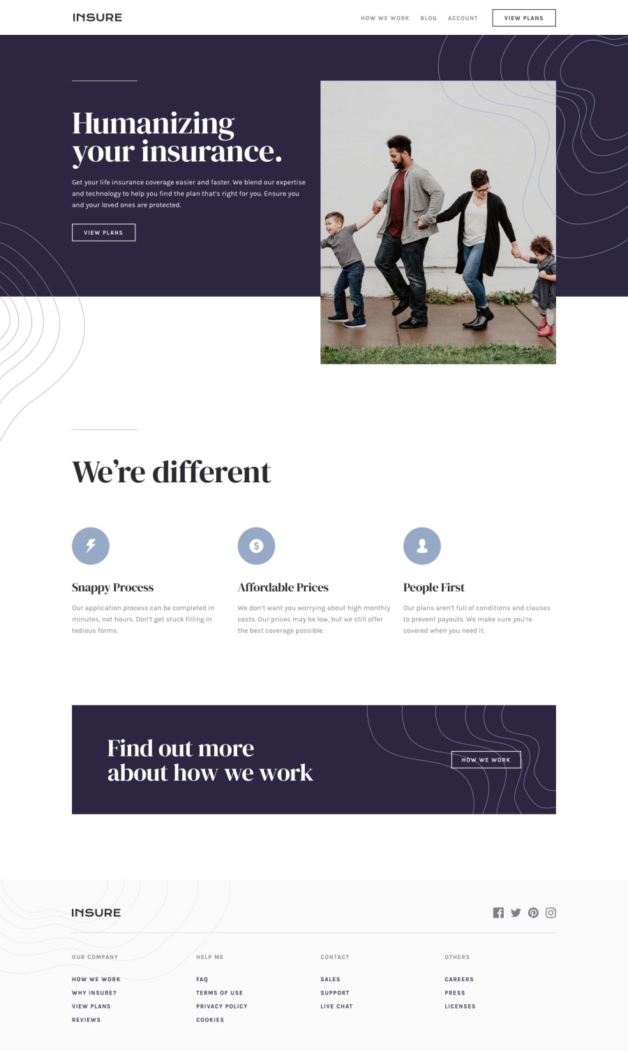
Design comparison
Solution retrospective
I am proud of my tenacity to finish this project and overcome some difficulties I faced along the way. I am proud of working methodically and resourcefully and not following a tutorial. Next time I would look at the tricky elements first and plan those out first. For example I would plan and research how to create the nav and reverse the order the images for desktop first before starting the html.
What challenges did you encounter, and how did you overcome them?So the first problem was the responsive nav bar. I found a tutorial but did not want to copy it exactly so I made my styles sheet mobile first and flipped the order of working so I could really see what was going on.
What specific areas of your project would you like help with?I know I have lots of improvements to make however I would like advice specifically on the styling. Would this project be better tackled with bootstrap or tailwind? I feel like a lot of my styling is repetitive and long.
Community feedback
Please log in to post a comment
Log in with GitHubJoin our Discord community
Join thousands of Frontend Mentor community members taking the challenges, sharing resources, helping each other, and chatting about all things front-end!
Join our Discord
