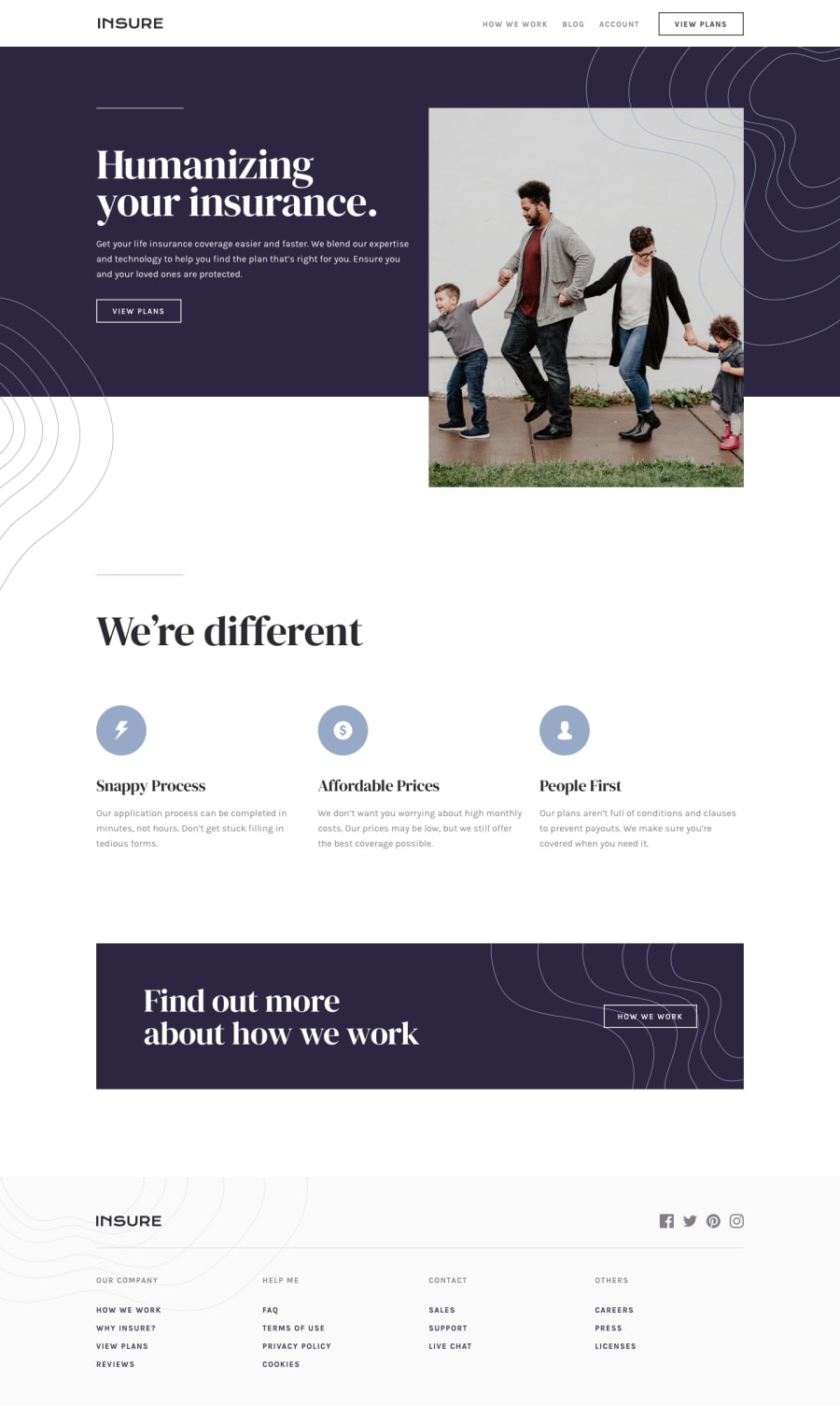
Design comparison
SolutionDesign
Solution retrospective
What are you most proud of, and what would you do differently next time?
I would like to say i have tried to make this website as closely as possible to the actual design, i have learnt many more things from this challenge and i try to make it better next time
What challenges did you encounter, and how did you overcome them?At first glance i thought with myself that how could i place those patterns on so i ended up using the absolute positioning from css using tailwind
What specific areas of your project would you like help with?if there was any problem with my solution please let me know its kindly appreciated
Community feedback
Please log in to post a comment
Log in with GitHubJoin our Discord community
Join thousands of Frontend Mentor community members taking the challenges, sharing resources, helping each other, and chatting about all things front-end!
Join our Discord
