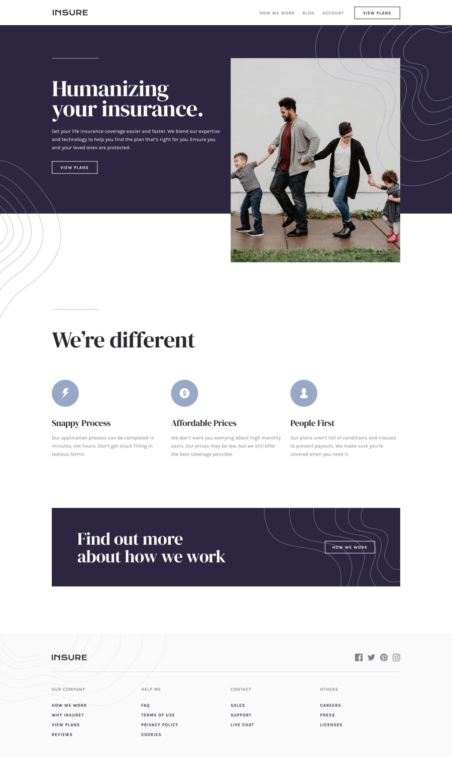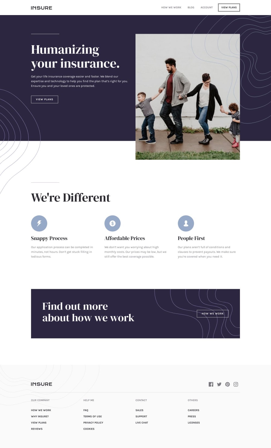
Design comparison
Solution retrospective
I never built a mobile navigation with just CSS before, but I had a lot of fun figuring it out without any outside help.
Let me know: would you ever use a solution like this on a real project?
Community feedback
- @mattstuddertPosted over 4 years ago
Hey Gerben, awesome work on this project! I'd definitely use this kind of solution. The only tricky/impossible thing would be making it fully-accessible with attributes like
aria-expanded
, which you'd need JS to toggle the values of. But you could do most of the heavy lifting this way and add a sprinkling of JS to enhance it.1@GerbenDolPosted over 4 years ago@mattstuddert Yeah, that's a point! Unfortunately at my job we do small temporary projects and accessibility doesn't get the attention it deserves.
Definitely something I'll drive into more soon!
Thanks for the feedback. 💪
0@mattstuddertPosted over 4 years ago@GerbenDol yeah, it's often overlooked which is a shame. But once you're used to it, it actually doesn't slow down development at all. Definitely worth fighting for!
0
Please log in to post a comment
Log in with GitHubJoin our Discord community
Join thousands of Frontend Mentor community members taking the challenges, sharing resources, helping each other, and chatting about all things front-end!
Join our Discord