Submitted about 4 years ago
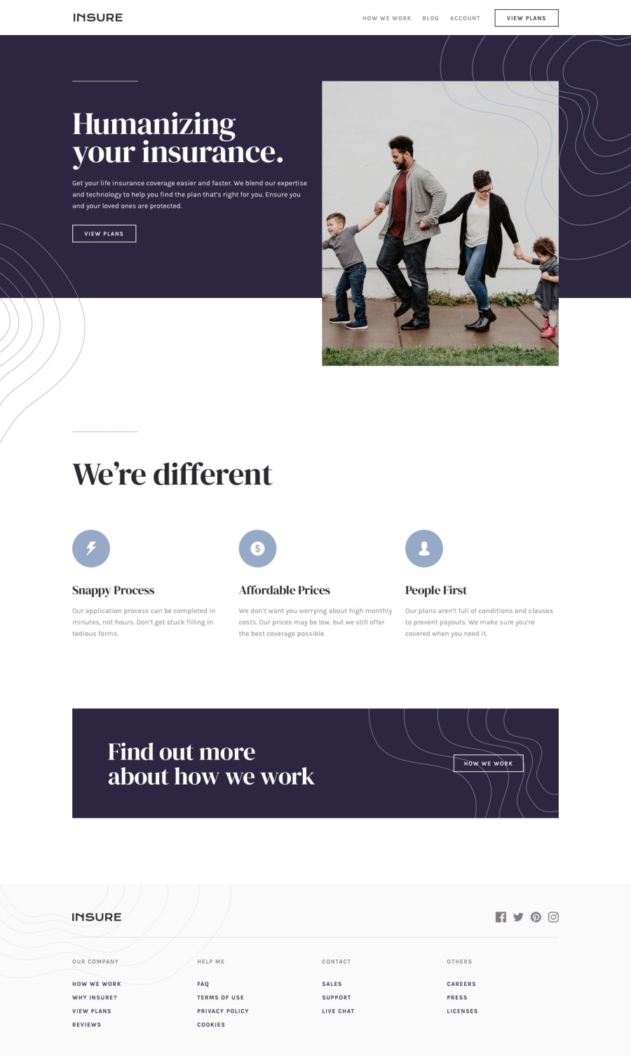
Insurance Landing Page - (HTML, CSS, FLEXBOX, GRID, JS)
@ritapetillo
Design comparison
SolutionDesign
Solution retrospective
Hi there, this is my last challenge. If you have any feedbacks, please let me know.
Thanks in advance!
Community feedback
- @mohamedsellamiPosted about 4 years ago
You did a great job keep going, Your design looks very close to the original design, i think if you edit the width in we're different section icons it will look more better and also i think there is no need for the overflow property in header and footer
0
Please log in to post a comment
Log in with GitHubJoin our Discord community
Join thousands of Frontend Mentor community members taking the challenges, sharing resources, helping each other, and chatting about all things front-end!
Join our Discord
