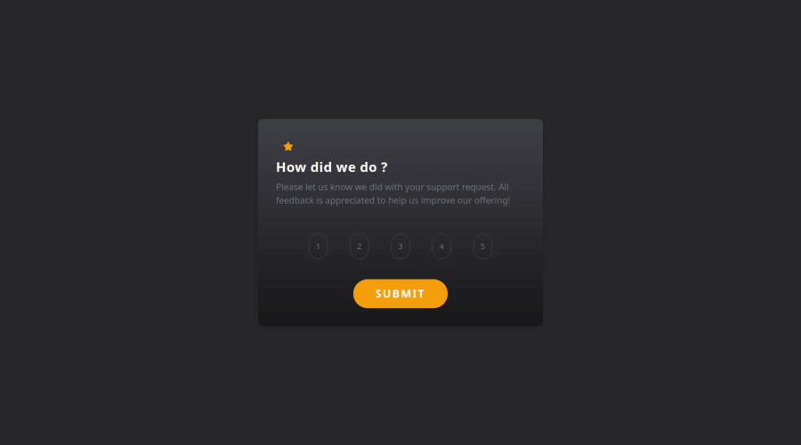
Design comparison
SolutionDesign
Community feedback
- @cfcmeirelesPosted 7 months ago
Great job with the solution. If I may add some feedback:
- Make sure to use the colors provided in the style-guide file that comes when you download the started files
- Same goes for the assets, the starter files come with an "images" folder with the images you need for the solution (for instance, the image that is displayed after the user submits a number)
- After the submit, you are using the number the user selected on the thank you message, don't forget to also include "[number selected] out of 5" using the highest number to always display after the selected rating
0
Please log in to post a comment
Log in with GitHubJoin our Discord community
Join thousands of Frontend Mentor community members taking the challenges, sharing resources, helping each other, and chatting about all things front-end!
Join our Discord
