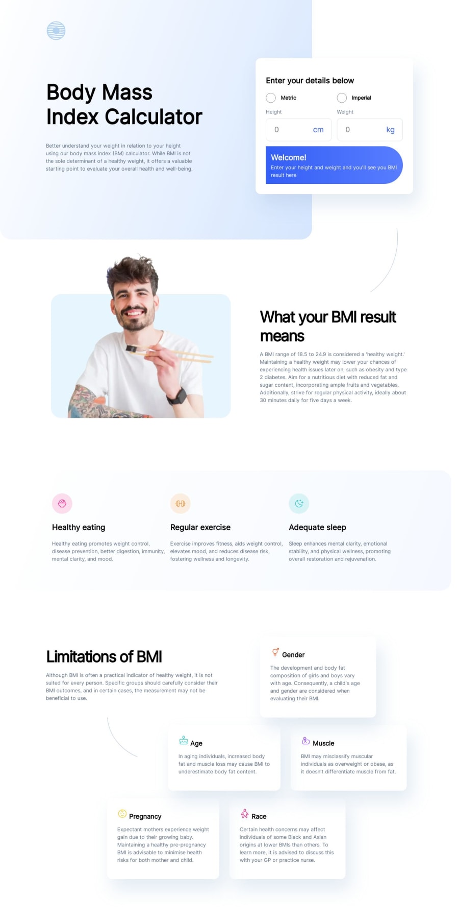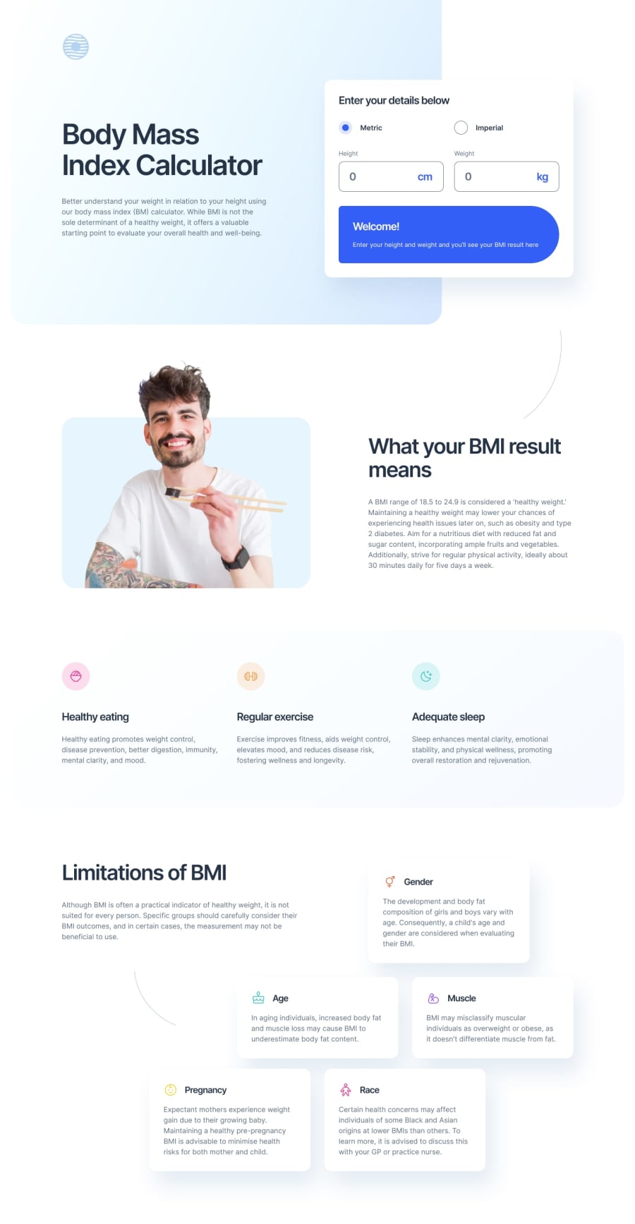
Design comparison
SolutionDesign
Solution retrospective
I found the layout to be the most challenging. I would like to know best practices for my JS. I feel like I used too many selectors for this project. Any suggestions or input on any aspect of this project would be greatly appreciated.
Community feedback
Please log in to post a comment
Log in with GitHubJoin our Discord community
Join thousands of Frontend Mentor community members taking the challenges, sharing resources, helping each other, and chatting about all things front-end!
Join our Discord
