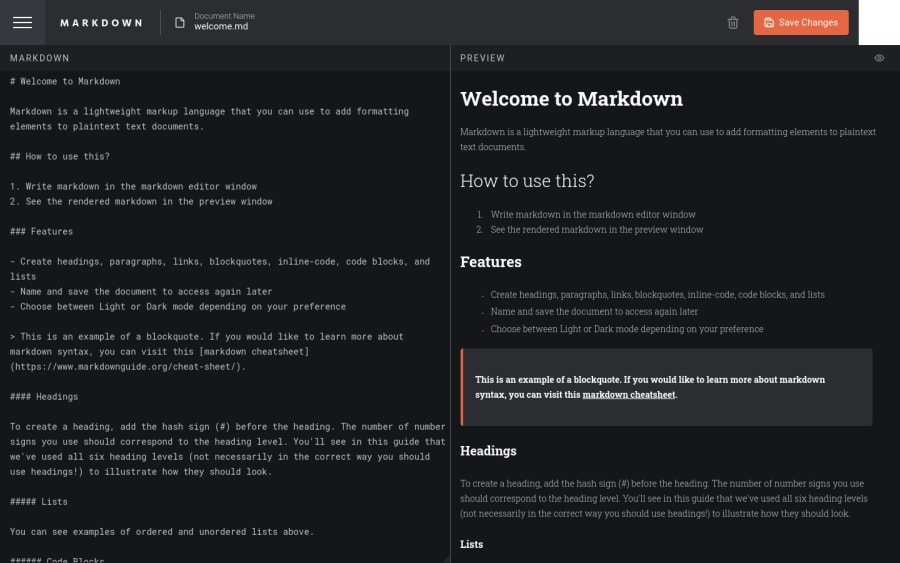
Design comparison
Solution retrospective
The key challenge for this project was not converting markdown to JSX, but instead managing user's markdown documents. I tackled this by using React context to create a document context which managed all CRUD operations. I decided to use localStorage to store user's documents, as I wanted to keep this a pure frontend project. To convert markdown to JSX, I used a converter found on npm which worked very well (markdown-to-jsx). For the theme, I also use React context.
Community feedback
- @leoikeh99Posted over 1 year ago
Very nice solution i have two reeomendations
- In your Sidebar, in the list of documents i think its better to set the
overflow
toauto
instead ofscroll
, this way the scrollbar only shows when it's actually needed. - Maybe remove your console logs.
P.S: I really like the responsiveness.
Marked as helpful2@nablancoPosted over 1 year ago@leoikeh99 Thanks!! I got sidetracked with real life and I guess I forgot to clean up my code :/ pretty embarrassing, thanks for notifying me!
1 - In your Sidebar, in the list of documents i think its better to set the
- @0xabdulkhaliqPosted over 1 year ago
Hello there 👋. Congratulations on successfully completing the challenge! 🎉
- I have some recommendations regarding your code that I believe will be of great interest to you.
HTML 🏷️:
- This solution generates accessibility error reports due to
non-semantic
markup, which lack landmark for a webpage
- So fix it by replacing the element
<div id="root">
the with semantic element<main>
in yourindex.html
file to improve accessibility and organization of your page.
- What is meant by landmark ?, They used to define major sections of your page instead of relying on generic elements like
<div>
or<span>
- They convey the structure of your page. For example, the
<main>
element should include all content directly related to the page's main idea, so there should only be one per page
LABELS 🔖:
input
elements wants alabel
associated with it
- A
<label>
is used to create a caption for a form control. The<label>
can be associated with a form control either implicitly by placing the control element inside the label element, or explicitly by using the for attribute
- Effective form
labels
are required to make forms accessible. The purpose ofform
elements such ascheckboxes
,radio
buttons,input
fields, etc, is often apparent to sighted users
BUTTONS 🖲️:
- And, this solution has also generated accessibility error reports due to lack discernible text for
<button>
element
- The
<button>
must have discernible text that clearly describes the destination, purpose, function, or action for screen reader users.
- Screen reader users are not able to discern the purpose of elements with role="link", role="button", or role="menuitem" that do not have an accessible name.
- The
<button>
name rule has five markup patterns that pass test criteria:
<button id="al" aria-label="Name"></button> <button id="alb" aria-labelledby="labeldiv"></button> <div id="labeldiv">Button label</div> <button id="combo" aria-label="Aria Name">Name</button> <button id="buttonTitle" title="Title"></button>
-
Ensure that each
<button>
element and elements withrole="button"
have one of the following characteristics:- Inner text that is discernible to screen reader users.
- Non-empty
aria-label
attribute. aria-labelledby
pointing to element with text which is discernible to screen reader users.role="presentation"
orrole="none"
(ARIA 1.1) and is not in tab order (tabindex="-1"
)
I hope you find this helpful 😄 Above all, the solution you submitted is great !
Happy coding!
Marked as helpful1@nablancoPosted over 1 year ago@0xAbdulKhalid Wow, great information! I will apply these improvements soon, cheers!
0
Please log in to post a comment
Log in with GitHubJoin our Discord community
Join thousands of Frontend Mentor community members taking the challenges, sharing resources, helping each other, and chatting about all things front-end!
Join our Discord