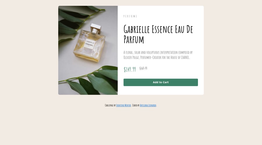
In this challenge, I mainly used Flexbox
Design comparison
Solution retrospective
I have a query, and it is about how good it is to use Grid for Layouts?
Community feedback
- @correlucasPosted about 2 years ago
Hola leonardo como estas?
Respondiendo a tu pregunta sobre Grid...
Tengo una regla (opinión personal) siempre uso GRID para crear diseños complejos y FLEX para posicionar elementos.
Por ejemplo, en este caso creé la estructura del componente con GRID y el diseño de la columna con FLEX.
FLEX y GRID son muy buenos pero flexbox es más versátil para cosas simples.
Link per mi solucion con GRID:
https://www.frontendmentor.io/solutions/product-preview-card-vanilla-css-and-custom-hover-state-on-hero-85A1JsueD1
Keep it up!
Marked as helpful0@LeonardoAntezanaPosted about 2 years agoMe resulto bastante util tu forma de resolver el desafio, muchas gracias!
0 - @DavidMorgadePosted about 2 years ago
Hello Leonardo, congrats on finishing the challenge! you did a pretty good job.
To answer your question, depends a lot in the situation when to use Grid or Flex, you usually use flex for simple containers that have only one row or one column of items (for example, a navigation bar, a footer...), and you use CSS Grid when you need complex layouts with multiple columns and rows (for example, an image gallery, an e-commerce products section...).
Apart from that, in this case I would go for flex to center your component in the middle of the screen instead of using margins, if you remove the margin of your component and add flex to the body like this:
body { display: flex; flex-direction: column; justify-content: center; align-items: center; }
Your component will get fully centered without the needs of margins!
Hope my feedback helps you! good job!
0@LeonardoAntezanaPosted about 2 years ago@DavidMorgade Thanks! I had thought about applying flexbox to the body but I needed to remove the margins for it to work, thanks again for the feedback!
1 - @TobshubPosted about 2 years ago
Hi! I love how you took this challenge by the horns and added your own touch to it. It's actually kind of refreshing to see such solutions. But I noticed you didn't add the SVG for the shopping cart into the 'add to cart' button. Was that on purpose, or did you just miss it?
0@LeonardoAntezanaPosted about 2 years ago@Tobshub wow, I opened the link and didn't see anything, it was because the background being clear didn't let me see it! I already corrected it, thanks for the feedback!
0
Please log in to post a comment
Log in with GitHubJoin our Discord community
Join thousands of Frontend Mentor community members taking the challenges, sharing resources, helping each other, and chatting about all things front-end!
Join our Discord