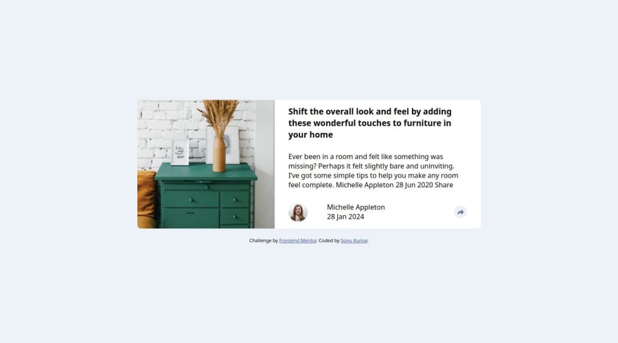
In this challenge i am using HTML,CSS & JS. In CSS:- Flex & js DOM.
Design comparison
Solution retrospective
What are you most proud of: I am most proud of the article-preview-component-master project that I created. This project involved implementing a responsive article preview component using HTML, CSS, and JavaScript. I am proud of how I was able to effectively structure the HTML, style it with CSS to create an appealing layout, and add interactive functionality using JavaScript. The project showcases my skills in front-end development and demonstrates my ability to create visually appealing and user-friendly components.
What would you do differently next time: Next time, I would focus more on optimizing the code and improving the project's performance. While the article-preview-component-master project functions well and meets its objectives, there is always room for improvement in terms of code efficiency and performance optimization. I would also aim to incorporate more advanced CSS and JavaScript techniques to enhance the component's visual appeal and interactivity. Additionally, I would pay closer attention to cross-browser compatibility and ensure that the component works seamlessly across different web browsers and devices.
Where you need support: I would appreciate support and feedback on improving the project's code structure and organization. Additionally, any tips or insights on optimizing performance and enhancing the component's functionality would be valuable. Finally, I am open to suggestions on how to further develop my skills in front-end development and create even more polished and professional-looking projects in the future.
What challenges did you encounter, and how did you overcome them?During the development of the article-preview-component-master project, I encountered several challenges, including: .1 Responsive Design: Ensuring that the article preview component looked good and functioned well on various screen sizes and devices was a significant challenge. I had to implement media queries and responsive design techniques to make the component adapt to different viewport sizes.
.2 JavaScript Functionality: Implementing the interactive functionality, such as toggling the article preview and displaying the social media icons, required careful planning and execution in JavaScript.
What specific areas of your project would you like help with?In the project, I would appreciate assistance with: .1 In the project, I would appreciate assistance with:
Implementing sorting functionality: I need help with writing JavaScript code to enable sorting of items in the project based on different criteria, such as date, popularity, or category.
.2 Responsive Design: Ensuring that the project layout and components are fully responsive across various screen sizes and devices, and implementing any necessary CSS or layout adjustments to achieve this.
.3 Accessibility: Making the project accessible to users with disabilities by following accessibility best practices, such as using semantic HTML, providing keyboard navigation, and adding appropriate ARIA attributes.
Community feedback
- @jmahamedPosted 12 months ago
Try mobile first development. make use of relative and absolute positioning to make sure the share pop up is where it is supposed to be. for example: the parent element, in this case the div holding the text and make the share pop up as position: absolute. then all you have to do is play around with top, right, left and bottom values until the position is right for example top: 50px; left: 500px;
good use of flexbox. it is possible to use margin values to make positioning more precise
0
Please log in to post a comment
Log in with GitHubJoin our Discord community
Join thousands of Frontend Mentor community members taking the challenges, sharing resources, helping each other, and chatting about all things front-end!
Join our Discord
