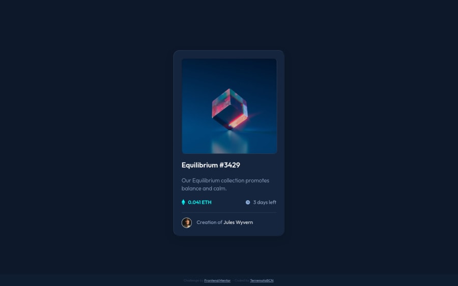
Improve coding skills by creating an NFT preview card component
Design comparison
Solution retrospective
This is my first challenge, I am testing new methodologies and workflows. Please leave me any suggestions so I can improve.
Thanks community!
Community feedback
- @vanzasetiaPosted over 2 years ago
Greetings, Terremoto! π
Congratulations on completing your first challenge! π Your solution looks pretty good! π
There are two things that can be improved.
- Firstly, I would not recommend making the
.attribution
to beposition: fixed
because on mobile landscape view, to be specific 640px * 360px, the attribution is on the card element which may be disturbing for some users. Instead, I recommend making it part of the layout which means you can adjust theflex-direction
of the parent element and add somemargin-top
to it to separate it from the card element. - Secondly, there should not be text in
span
anddiv
alone; instead wrap the text with a meaningful element.
That's it! Hope you find this useful! π
Marked as helpful1 - Firstly, I would not recommend making the
- @shashreesamuelPosted over 2 years ago
Hey good job completing this challenge
Keep up the good work
Your solution looks great however I think that the image and card is not supposed to have a stroke .
In terms of your accessibility issues simply wrap all your content between main tags
I hope this helps
Cheers Happy coding π
Marked as helpful1@terremotoBCNPosted over 2 years ago@TheCoderGuru Indeed they had no borders, I just wanted to be a little creative and give it a little depth effect. XD
In other way I am interested in the point of the
<main>
tag, I understand in a document there can only be one<main>
tag and I had put one to wrap the card components in case there was more than one. The card component is an<article>
tag.Do you mean that the same component card should be a
<main>
tag?Thank you very much for your help and support.
0@vanzasetiaPosted over 2 years ago@terremotoBCN The card element should only be wrapped with
main
element. However, I think using thearticle
tag won't hurt the accessibility either. I believe that thearticle
tag in this case behaves like adiv
.Usually, you want to only use
article
orsection
to give emphasize a section of the page and it needs to have a label (usingaria-labelledby
) which usually a heading tag.Marked as helpful1 - @Kamasah-DicksonPosted over 2 years ago
Your solution is great but remove every position property on the footer and add text align center to fix the footer from overflowing content on mobile. Good job keep codingπ
Marked as helpful1
Please log in to post a comment
Log in with GitHubJoin our Discord community
Join thousands of Frontend Mentor community members taking the challenges, sharing resources, helping each other, and chatting about all things front-end!
Join our Discord