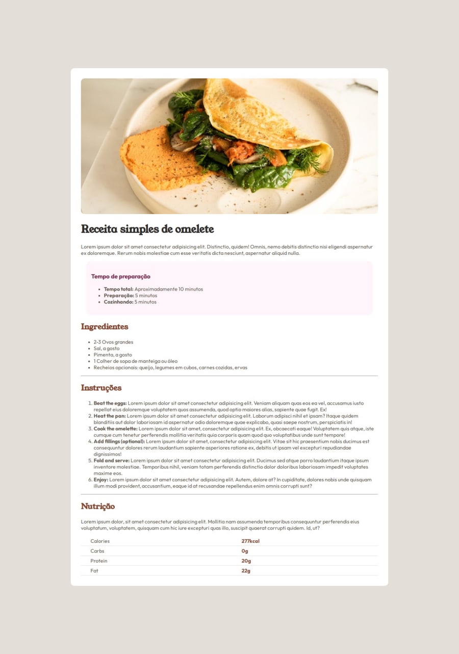
Implementing the table to display the recipes was rewarding.


Design comparison

Solution retrospective
I was very pleased with the result, as it was my first practical challenge after learning about HTML and a little CSS. That was enough to solve this challenge. The website could be responsive so that it could be accessed by people using smartphones. However, I haven't gotten around to studying responsive websites yet. For sure, next time, I would implement a responsiveness.
What challenges did you encounter, and how did you overcome them?I encountered two challenges. I had difficulty putting a continuous line in the nutrition table, which was getting one line for each item, that is, it was getting a divided line and not continuous like the proposed challenge. Solve with this line of CSS code:
table {
    border-collapse: collapse;
    width: 100%;
}
Another challenge I encountered was selecting the markers from the lists and changing their colors, but I managed it with the following command.
li::marker {
    color: hsl(14, 45%, 36%);
}
I would like you to show me good practices that I could adhere to in this resolution.
Please log in to post a comment
Log in with GitHubCommunity feedback
No feedback yet. Be the first to give feedback on Gabriel Oliveira's solution.
Join our Discord community
Join thousands of Frontend Mentor community members taking the challenges, sharing resources, helping each other, and chatting about all things front-end!
Join our Discord