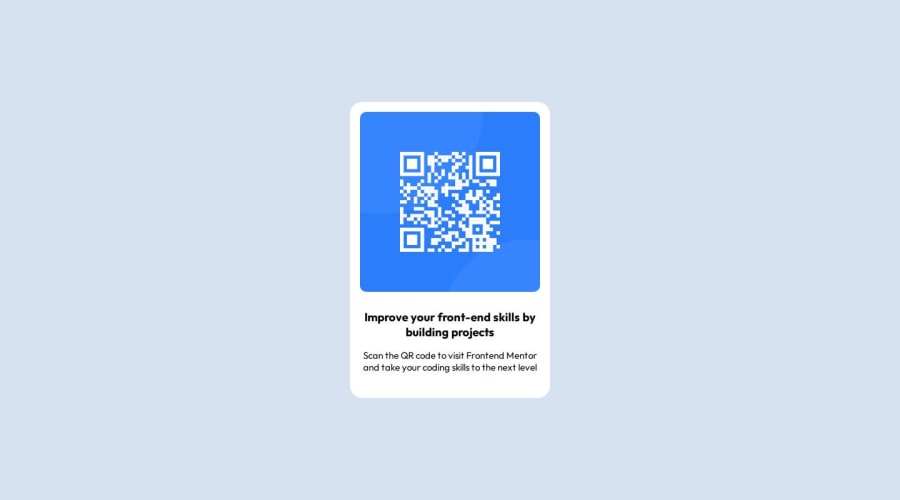
Design comparison
Solution retrospective
- I always used TailwindCSS for a long time, but this time I completed the challenge from scratch with CSS!
- I will use SCSS next time
- I cannot center the div container vertically even though I understood and practiced Flexbox before
- To overcome the problem, I read my previous project
- Are there any consequences if we do not create the same User interface as the design by the designer? Let's say it just looks like 90%.
- What are the common-used properties of Flexbox? I usually use
display: flex, justify-content: * & align-items: *
but I rarely use the others. - Can you recommend some components or challenges that will help me enhance my Flexbox knowledge?
Thank you for spending time on my questions.
Community feedback
- @R3ygoskiPosted 7 months ago
Hello Hien, congrats, you project is very good and almost similar to the proposed design.
About your first question, No, there's no consequence, you don't need to create the solution 100% similar to design, but, it's highly recommended to make it's closer as possible. A tip, use PerfectPixel it's help a lot.
About your second question, those you mentioned are the most common, and probably you will need to use
flex-direction
in some cases too.About your third question, yes, there's two "challenge" outside of frontend mentor, that's focused in develop you flexbox skill, Flexbox Froggy and Flexbox Defense. Both may be helpful to you.
About the difficult you had, I'm pretty sure it's happened because of
body
right? I highly recommend to always start styling yourbody
with flex.A tip, always try to create your solution with Semantic HTML, it's very recommendable, because it's help a lot in accessibility and SEO of your page. An example where you could use Semantic HTML in your code :
<div class="main-outer_container">
could be a<main>
tag, because this is the main content of your page. And there's some other<div>
that could be changed to semantic HTML.Other tip related to accessibility is about your heading, never jump over the heading levels, it's not recommended, the right manner to work with it, is starting from
<h1>
and increase progressively. And then you just need do style your<h1>
to be more similar to the proposed design.Some links about what I said.
And again, congrats, keep practicing and improving your skills, if something I said was unclear, please, feel free to comment below, I will try to help in best possible way.
Marked as helpful2@hinn1411Posted 7 months ago@R3ygoski Thank you for your advice. it is very helpful for me!
1 - @sivaprasath2004Posted 7 months ago
Hello i`ll wishing for your completion project solution.
- I will give some suggestion i believe its used for improve your skill.
- In CSS You will use
.main-outer_container { padding: 16px; }
I will recomand for Using rem values for padding provides a scalable and flexible approach, especially when considering accessibility and responsive design.
.main-outer_container { padding: 1.3rem; }
Marked as helpful1@hinn1411Posted 7 months ago@sivaprasath2004 Thank you very much! It is really valuable fo me.
0
Please log in to post a comment
Log in with GitHubJoin our Discord community
Join thousands of Frontend Mentor community members taking the challenges, sharing resources, helping each other, and chatting about all things front-end!
Join our Discord