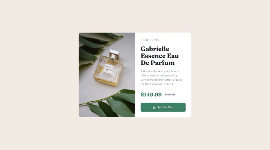
Design comparison
Solution retrospective
Practising making the HTML as semantic as possible and thinking of aria
What challenges did you encounter, and how did you overcome them?SVGs!
What specific areas of your project would you like help with?- SVG - I ended up just pasting it as an inline in the end. I struggled with the other method of using with the svg as a src. I've read about the viewbox, but I could'nt make it fit correctly. The "intrinsic" height and width on the raw svg seems to be width="15" height="16", but clipped the image. I tried removing one of width or height and it didn't work either.
I tried using https://developer.mozilla.org/en-US/docs/Learn/HTML/Multimedia_and_embedding/Adding_vector_graphics_to_the_Web and mirroring
It might be something to do with viewboxes I feel, but I can't quite figure out how to use the with the svg as src in this case - any help would be much appreciated :)
Please log in to post a comment
Log in with GitHubCommunity feedback
- @Ibtehaj-Ali-1
Everything is looking great. Just work on
font-sizeandmarginbetween every element.
Join our Discord community
Join thousands of Frontend Mentor community members taking the challenges, sharing resources, helping each other, and chatting about all things front-end!
Join our Discord
