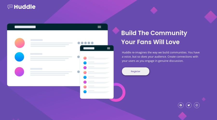


Design comparison

Solution retrospective
Hi, looks like I've done it, but I'm sure that position absolute technique that I used here is not the best solution. When you resize the page in desktop view you can see the consequences. What could I've done better?
Thank you!
Community feedback
- @adityaphasuPosted over 1 year ago
Hi,
- The reason why the SVG cut into half when you try to reduce the width is that when the width is reduced the aspect ratio gets distorted. (the original aspect ratio is lost, to maintain it you have to change the height accordingly)
🎯 You can use another and much simpler approach , instead of adding svg as an element directly to the html you can use the image tag and just set the src to the svg location like this:
<div class="header-images">
<img src="images/illustration-mockups.svg" alt="" />
</div>
and then adding
max-width: 100%to the img which will scale it accordingly.After this you can remove background color from
.header-imagesas you wont be needing it.- You can do this for the logo as well.
Hopefully this clears your doubts and help you move forward with this project! 🙂
Good luck!😉
Marked as helpful1@BBualdoPosted over 1 year ago@adityaphasu Hi, Thank You for your advise, I didn't check out images folder before. It helped a lot. But when I finished the project I'm not sure about my technique here. Could you please verify it and point my mistakes out? :) Thank you.
1@adityaphasuPosted over 1 year ago@BBualdo I'm glad you got it! The design looks quite nice!
🎯 Few things you can improve are:
- The "Buid your community your fans will love" is actually a heading and not a paragraph. Change it like this:
<div class="page-title"> <h1>Build The Community Your Fans Will Love</h1> </div>- You dont really need to add the bg-images in your html you can directly add them to your body using
background-imageproperty like this:
body{
background-image: url("/images/bg-desktop.svg")
}
You can change the url with media query for mobile like this:
@media (max-width: 400px) {
body{
background-image: url("/images/bg-mobile.svg")
}
You can also play around with its size with
background-sizeproperty to match the design!After this you wont be needing this and you can remove this from your html:
<div class="page-background"> <img class="mobile-bg" src="images/bg-mobile.svg" alt=""> <img class="desktop-bg" src="images/bg-desktop.svg" alt=""> </div> // Remove all of this- It seems that you have imported the fonts separately but actually you can just import them once! like this:
<link rel="preconnect" href="https://fonts.googleapis.com">
<link rel="preconnect" href="https://fonts.gstatic.com" crossorigin>
<link href="https://fonts.googleapis.com/css2?family=Open+Sans&family=Poppins:wght@400;600&display=swap" rel="stylesheet">
For future projects if there are more than one font just click on the style guide fonts one by one for google fonts and add them to the font list on google fonts before importing, It's nothing much but helps with faster page loads and less code.
Keep on improving and good luck!😸
Marked as helpful1@BBualdoPosted over 1 year ago@adityaphasu I will have this in mind creating next design, thank you :D
1

Please log in to post a comment
Log in with GitHub
Join our Discord community
Join thousands of Frontend Mentor community members taking the challenges, sharing resources, helping each other, and chatting about all things front-end!
Join our Discord