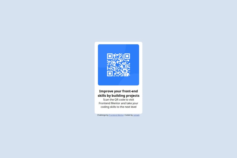
Design comparison
Solution retrospective
I did all of this alone even though it was hard to fix the github etc.. I managed to learn github and make a new website! Now i have learnt how to make a live-url!
What challenges did you encounter, and how did you overcome them?To be fair i used a website called Flexbox Froggy. I had a problem with layouts, especially putting the layouts in the middle of the website. With the help of Flexbox Froggy, it went good!
What specific areas of your project would you like help with?Im a new student taking a bachelor degree in technology. This is my first time making a website. I have few question to whoever who reads this message:
- is the structure good? is it easy to see and understand?
- do you have any recommendations to start making a website? i kinda got off on the start.
- where did i do bad? can you point everything out so that i can learn.
Thank you!
Please log in to post a comment
Log in with GitHubCommunity feedback
- P@defenstration
Hi @ramiadi,
I think you made a good rough draft, and just need to add some finishing touches.
Just looking at the comparison, your sizing is a bit off and you should check your colors on the font. Mostly it's just playing with the padding.
Going into your code, the first thing I would challenge you to do is to get comfortable using a css stylesheet. It is a best practice to separate out your styling to CSS. There is a concept called separation of concerns about having your HTML be the structure, CSS be styling, and JS be function. It's a good way to look at things as you are learning.
You have an 'alt' on your image! Awesome! I totally forgot to do that for my first few projects. It's a key part of accessibility. Another part is using semantic HTML, and you are using HTML tags pretty well. The next step is to make sure you use header, footer, and main tags to organize the body of your code. Headers and footers are optional, but you should have a main (only 1) that contains the "main" part of your page.
Don't be afraid to use header tags. I think you could improve the contents of your card by changing up your structure a bit. The first line "Improve your..." could be a "heading", with the paragraph following it being the "content". Having that heading as an h1 would also give screen readers a place to start.
Quick tip - when you start adding these you can use grid to move the attribution to the bottom of the page easily.
grid-template-columns: auto 1fron your body if you only have a main and footer.Nothing you did was "bad." The whole point is to learn, which is what you are doing. As far as how to start building a site, I can only share my process. With these challenges I:
- Setup a Github repo and clone into it on VS Code
- Download the challenge and extract it into the cloned folder
- Read through the readme, check the preview, and set up the sheets. I always add a styles.css and script.js (if needed)
- I step back and start looking at the components and develop a plan for what classes I'll need, what tags I'll use, how to structure them, and what layout tools I use. I try to come up with a plan to tackle the project with and I write that on paper. I find this to be the most important part of the project
- Structure the HTML and CSS
- Start styling!
All of this said, I am still learning too. I hope some of this helps. Stay awesome!
Join our Discord community
Join thousands of Frontend Mentor community members taking the challenges, sharing resources, helping each other, and chatting about all things front-end!
Join our Discord
