Submitted 7 months ago
I0 have used CSS properties to have page responsive

@varunKumar993

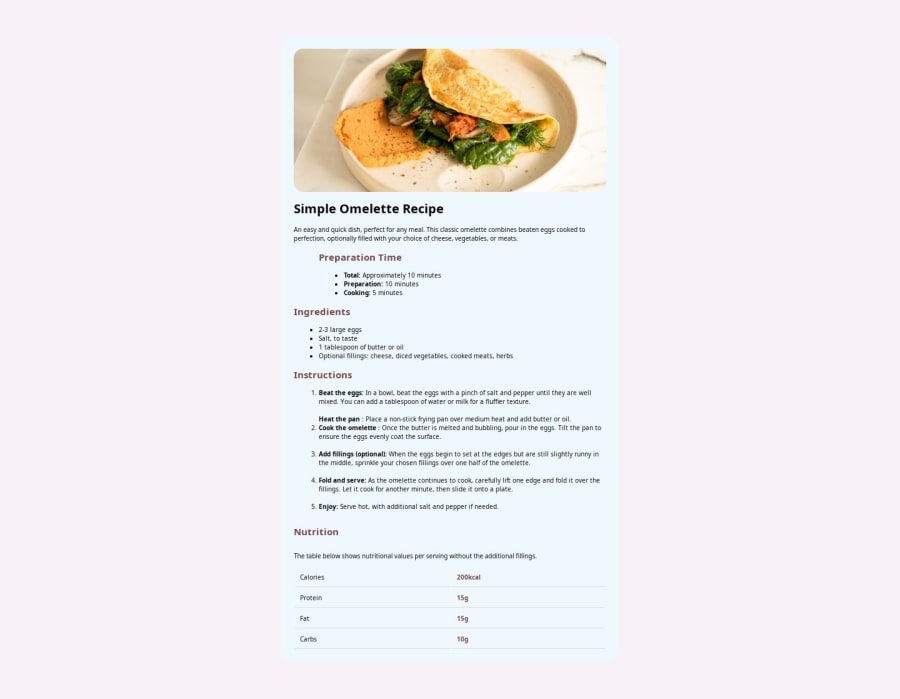
Design comparison
SolutionDesign

Solution retrospective
What are you most proud of, and what would you do differently next time?
it was a good project to understand how HTML and CSS works
What challenges did you encounter, and how did you overcome them?it was a good project to understand how HTML and CSS works
Community feedback
Please log in to post a comment
Log in with GitHub
Join our Discord community
Join thousands of Frontend Mentor community members taking the challenges, sharing resources, helping each other, and chatting about all things front-end!
Join our Discord