
Submitted about 1 year ago
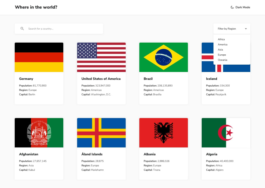
I utilized React.js alongside Tailwind CSS for styling.
#react#tailwind-css#react-router

@Princy-patel
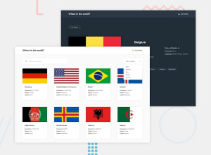
Design comparison
SolutionDesign
Solution retrospective
What specific areas of your project would you like help with?
This project helped me improve my skills in API integration and React Router.
Community feedback
- @jenna1kPosted 7 months ago
good job!
some sugggestions:
- Handling Fewer Search Results When the search results are fewer than expected, the layout can sometimes break or appear unbalanced, especially if the CSS is not designed to handle such cases. To mitigate this: Flexbox or Grid Layouts: Use CSS Flexbox or Grid to create a more adaptable layout. These layout models allow for better control over item alignment and spacing, which can help maintain a cohesive look even with fewer items. Minimum Height: Set a minimum height for the container holding the search results. This prevents the layout from collapsing when there are fewer items.
- for image sizes, consider using rem or px units. This will make your layout more responsive and less dependent on the viewport height.
- User Experience When Clicking Outside Open Select Options When a select dropdown is open and the user clicks outside of it, it can cause confusion and a poor user experience in certain situations
1@Princy-patelPosted 7 months agoHello, @jenna1k
I appreciate your suggestions! I’ll implement these ideas to improve the layout and user experience. Thank you!
0

Please log in to post a comment
Log in with GitHub
Join our Discord community
Join thousands of Frontend Mentor community members taking the challenges, sharing resources, helping each other, and chatting about all things front-end!
Join our Discord