


@MahmoodHashem
Posted
Hello There!
Congratulations on Completing the challenge
Here are some useful tips that you might find helpful:
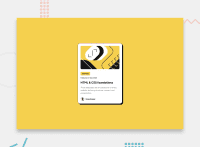
Centering the Card Vertically
To center the card vertically, you should set the height of the body element to 100vh (100% of the viewport height) and remove any margin. This will ensure the card is centered both horizontally and vertically within the viewport.
body {
display: flex;
justify-content: center;
align-items: center;
height: 100vh;
margin: 0;
}
By setting the height of the body to 100vh, the body will occupy the full viewport height, and the display: flex with justify-content: center and align-items: center will center the card both horizontally and vertically within the body.
Card Width and Height
Using a fixed width for the card is not the most responsive approach. Instead, you should consider using max-width to allow the card to adjust based on the screen size. Additionally, setting a fixed height is not practical, as the card's height should be determined by its content.
css
.card {
max-width: 500px;
background-color: white;
box-shadow: 0010pxrgba(0, 0, 0, 0.1);
border-radius: 10px;
padding: 20px;
}
By using max-width: 500px, the card will retain a maximum width of 500px, but it will shrink as the screen size decreases, making the design more responsive. Additionally, removing the fixed height will allow the card's height to be determined by its content, ensuring a better fit for the user's needs.
With these changes, the card will be centered both horizontally and vertically within the viewport, and its size will be more responsive to the user's screen size.
Hope you find this helpful
Keep up the hard work
