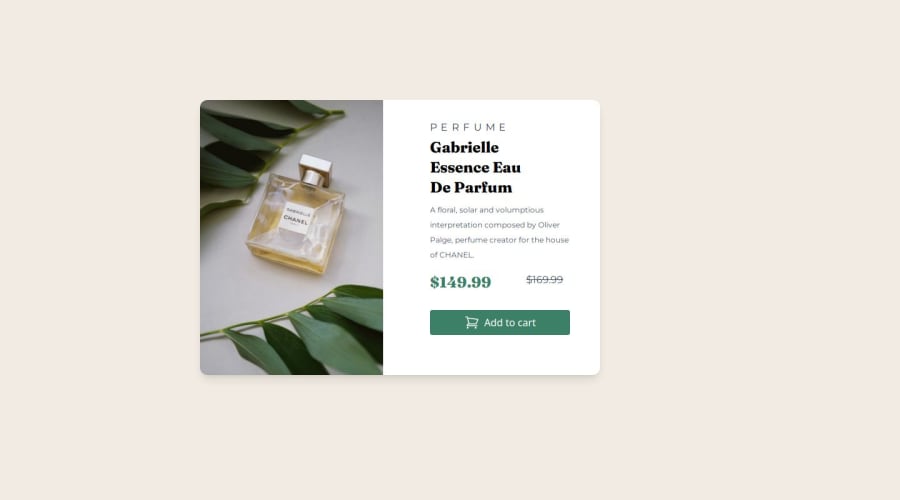
Design comparison
SolutionDesign
Solution retrospective
What are you most proud of, and what would you do differently next time?
I recently started learning how to use Tailwind CSS and I used it in this project
What challenges did you encounter, and how did you overcome them?I just had a little struggle navigating Tailwind
Community feedback
- @MahdyrllPosted 6 months ago
make the button border rounder. right side has too much padding and a little empty spaces around it. the width and the font size of the texts are not the same. at the end, the space between price elements are a lot. good luck in the next project.
Marked as helpful0
Please log in to post a comment
Log in with GitHubJoin our Discord community
Join thousands of Frontend Mentor community members taking the challenges, sharing resources, helping each other, and chatting about all things front-end!
Join our Discord
