Submitted about 4 years ago
I used some help from the web during the challenge
@Abhinay5180
Design comparison
SolutionDesign
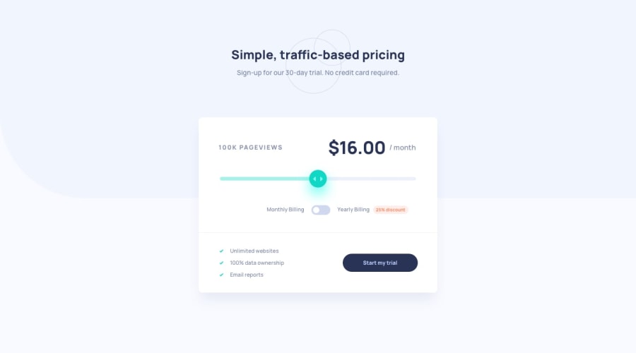
Solution retrospective
Feel free to give your valuable feedback, So that I can improve.
Community feedback
Please log in to post a comment
Log in with GitHubJoin our Discord community
Join thousands of Frontend Mentor community members taking the challenges, sharing resources, helping each other, and chatting about all things front-end!
Join our Discord
