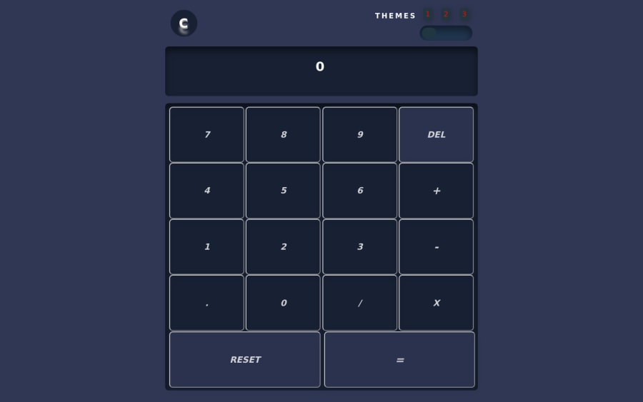
I used simple plain css html jquery and plain javascript whenever poss
Design comparison
Solution retrospective
I did not use the extact colors as the appear on the models instead i concentrated on the basic fucntionality and layout. I would love to hear from what you guys think. Feedback in important to me. Thanks.
Community feedback
- @folathecoderPosted over 3 years ago
Hi Pal! I don't think the multiplication works. I tried it few times. Kindly check it out! Great work! 👍
2 - @palgrammingPosted over 3 years ago
Overall even though you did not try to duplicate the given design I like the creative license taken and you ended up with overall a good project but if you want I see a few things.
1 in the theme changing area it seems like the first place the user would try to click would be on the slider to change themes and not the 1,2,3 above it. You have the cursor changing to pointer on the dot but then clicking the dot does nothing
2 over all I do not like the stretchiness of the design. The user experience at 1013px and 1014px is a totally different product... also on theme 1 somehow buttons are style changes
yes open the screen to 1014px or larger while theme one is selected then select any other theme and then return to theme one and theme one changes from solid to outline buttons but then refresh the page and then solid buttons return
Over all a nice job but it still needs a little refinement
1
Please log in to post a comment
Log in with GitHubJoin our Discord community
Join thousands of Frontend Mentor community members taking the challenges, sharing resources, helping each other, and chatting about all things front-end!
Join our Discord
