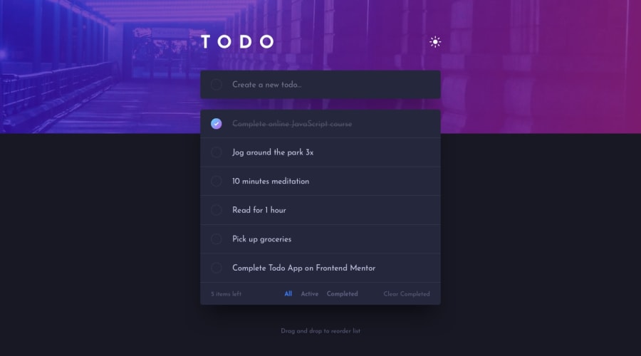
I used sass, vanilla js and sortable.js for re ordering
Design comparison
Solution retrospective
this was FUN some edge cases in the UI gave me a headache :) I will have to come back to this later to fix up some stuff. any feedback on it / what could be improved will be appreciated thanks!
Community feedback
- @JunjiequanPosted almost 4 years ago
Design wise looking great, functionality working all good, overall I'd say this is pretty decent.
If I were being picky, here is some details might worth pay attention to:
- close mark outline transitions with unbalanced height.
- long text of todo item breaks out on mobile.
- text input length of addTodo section is too short for desktop, it has only roughly 180px width.
- click empty circle to create todo item is kinda weird.
Hope this helps :)
0@emiomacollinsPosted almost 4 years ago@a331998513 thanks for the feedback. I'll fix those as soon as I can
0
Please log in to post a comment
Log in with GitHubJoin our Discord community
Join thousands of Frontend Mentor community members taking the challenges, sharing resources, helping each other, and chatting about all things front-end!
Join our Discord
