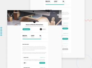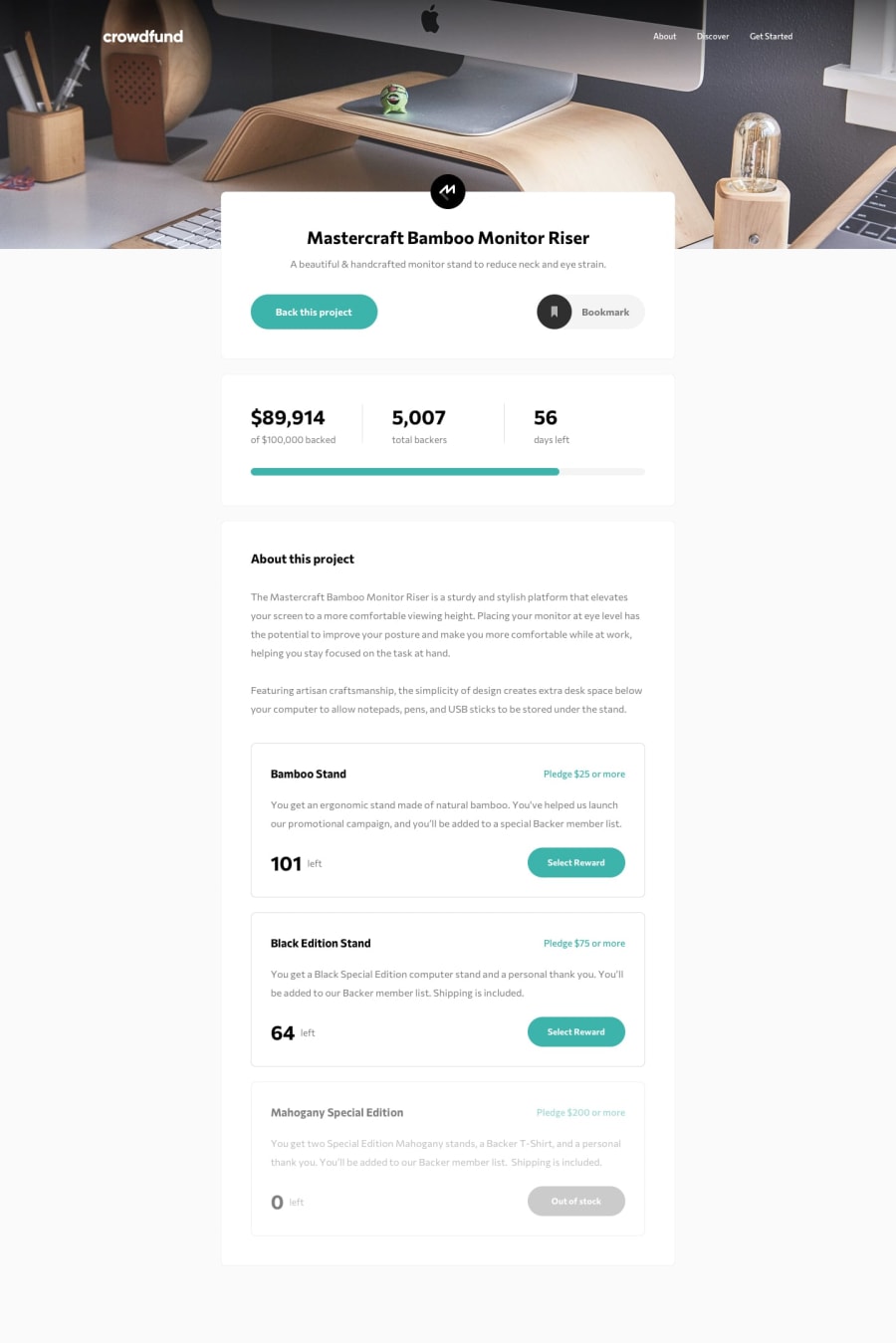
Design comparison
SolutionDesign
Solution retrospective
feedbacks appreciated!
Community feedback
- Account deleted
Nice job on completing the challenge.
Desktop view looks good, nothing seems to be out of place. On mobile I think the picture needs to have a fixed height because just after the switch from desktop it is rather tall, and when you return to desktop while the mobile menu is active the shadow stays on there, it does not get dismissed.
And while at it, how about you check out the report.
Keep coding👍.
Marked as helpful1@benjaminli7Posted over 3 years ago@thulanigamtee thank you for your feedback! i will try to fix all those issues :C
0
Please log in to post a comment
Log in with GitHubJoin our Discord community
Join thousands of Frontend Mentor community members taking the challenges, sharing resources, helping each other, and chatting about all things front-end!
Join our Discord
