Submitted 8 months ago
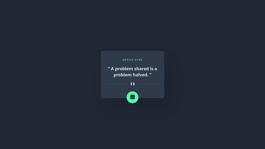
i used: responsive, data.json , fetch api
#jss
@gia-grigalashvili
Design comparison
SolutionDesign
Community feedback
- P@MarcoDV47Posted 8 months ago
Hey, it's pretty good!
Just a few tips to improve:
- Use the pointer cursor when hovering the button and slightly change the appearance.
- Add a little more margin on smaller screens so it don't touches the edges.
Great job, keep going!
Marked as helpful0@gia-grigalashviliPosted 8 months ago@MarcoDV47 Hello MarcoDV
Thanks for the evaluation, I will definitely take into account everything you told me, this is my first project and I will take it into account in the next one good luck
1
Please log in to post a comment
Log in with GitHubJoin our Discord community
Join thousands of Frontend Mentor community members taking the challenges, sharing resources, helping each other, and chatting about all things front-end!
Join our Discord
