Design comparison
SolutionDesign
Community feedback
- @mendesdomingosdevPosted about 1 year ago
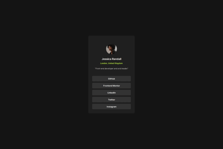
It looks good, I think the only problem here is the size of the things and spacement, but we don't have the figma files to make it better.
0
Please log in to post a comment
Log in with GitHubJoin our Discord community
Join thousands of Frontend Mentor community members taking the challenges, sharing resources, helping each other, and chatting about all things front-end!
Join our Discord
