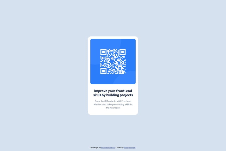
Design comparison
Solution retrospective
Im proud of the CSS because it took me no time to make and the html was easy to do and I have struggle with this two for a long time
What challenges did you encounter, and how did you overcome them?I didnt encounter a challenge on this project
What specific areas of your project would you like help with?If someone have a CSS tip or HTML that would improve my code I appreciate
Community feedback
- @MlcodeDevPosted 6 months ago
I love this project but you should use
remunits rather thanpxfor font-size so that it won't interfere with user preferences. Some people, especially old people like to set a larger font size, andremis a scalable font size so it makes it possible to scale up, but when you set your font-size to px, it is unable to scale.Marked as helpful1@rodrigoo-alvesPosted 6 months ago@MlcodeDev thanks i will make the changes, I learned to always use px but i know that rem is better for resposive, just need to get used to
1@MlcodeDevPosted 6 months ago@rodrigoo-alves
pxis a good unit for styling borders, letter-spacing etc. but because of it's unscalable nature when you apply it for e.g. to margin or padding it would look terrible on different viewport's.0@MlcodeDevPosted 6 months ago@MlcodeDev I recommend learning
em,rem,vw,vhand know when to use them, kevin powell made a great video about it, I recommend checking it out https://youtu.be/N5wpD9Ov_To?si=mZnTh2GM1F8YszG20
Please log in to post a comment
Log in with GitHubJoin our Discord community
Join thousands of Frontend Mentor community members taking the challenges, sharing resources, helping each other, and chatting about all things front-end!
Join our Discord
