Submitted about 2 years ago
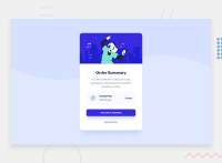
i used language html for structured the web site and css3 for style it
@ordyfandio
Design comparison
SolutionDesign
Community feedback
- @correlucasPosted about 2 years ago
👾Hello Ordy, congratulations for your solution!
Your solution design is almost done, you need only to fix the background and align the card.
Here's my tips for you:
1.Fix the background using
background-size: coverto display the background full width without crop..img { background-size: cover; background-attachment: fixed; }2.Align the component using flexbox, I saw that you've used
position: relativebut isn't the best way because its hard to manage the component depending of the context:Use it instead to align:
body {min-height: 100vh;
display: flex;}

section {
    display: flex;
    max-width: 350px;
align-items: center;
    justify-content: center;}
Hope it helps and happy coding!
0
Please log in to post a comment
Log in with GitHubJoin our Discord community
Join thousands of Frontend Mentor community members taking the challenges, sharing resources, helping each other, and chatting about all things front-end!
Join our Discord

