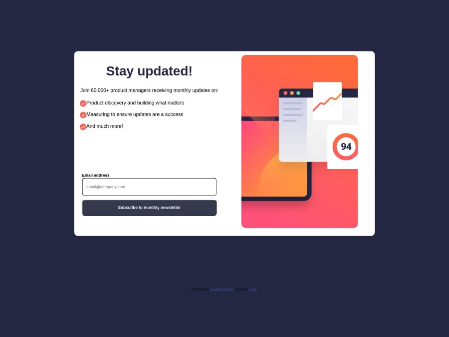
Design comparison
Solution retrospective
so... i used JavaScript for this Challenge. To be honest, i could have usad an href to navigate to the page, but the challenge required javascript, so why not? i used onclick to hide a significant part of the tags and make other ones appears.
Community feedback
- @sgarcialagunaPosted about 1 year ago
The dialog element does most of the work for you in this challenge.
https://developer.mozilla.org/en-US/docs/Web/HTML/Element/dialog?retiredLocale=de
Marked as helpful0 - @felipestefaniPosted about 1 year ago
Hey, Joash!
How are you? Hope doing great! 😉
I liked a lot the hover status you have done in the button! 👌
Beside that, you really could have used a href to navigate to the page, but it is not as performative as using js.
and you could have used js to do some validations as email verification. A good idea is implement a regex to support the validations:
mailFormat = /^\w+([\.-]?\w+)*@\w+([\.-]?\w+)*(\.\w{2,3})+$/
This way your user experience get more interesting!!
When I come to see the preview site, the images are broken... Anything's all right with deployment?
Keep going, your project ir very nice! I liked a lot 💫
1 - @YassineafailaPosted about 1 year ago
hi bro , hope you doing great :D you need to add to the buttons a cursor-pointer, and if you want also to add a function to the dismiss message button for back to the first page .
0
Please log in to post a comment
Log in with GitHubJoin our Discord community
Join thousands of Frontend Mentor community members taking the challenges, sharing resources, helping each other, and chatting about all things front-end!
Join our Discord